One week after the visionOS and Vision Pro announcement, it seems clear we’re about to start a new phase of our relation with information and knowledge. Breaking free from the limitations of a flat rectangular support, new forms of representation and interactions are about to emerge. Because they will affect expectations from users, this is consequential for all digital products and the interface design practice.
These initial observations are based from what Apple has communicated so far, and first hand experience reports from people who were lucky enough to get a demo last week. We don’t have the full picture yet, but enough structural elements are before us, pointing to a place where using a mouse is going to feel like the past.
Vision Pro
All accounts place this device capabilities well above other current headsets. Together, they enable the comfortable and reliable experience testers have been describing. They make the device almost disappear and let the user focus on the content.
Field of view: iso to natural vision.
Image quality: pixels are not perceptible, images refresh at a 90Hz rate. This makes reading text a non issue.
Interpretation of the environment: all tests were done in spaces specifically designed for the demos, so reports might not reflect real life use. But these demos showed very stable virtual content and very little visual distortion from reality in pass through mode, allowing for the sentiment of really “being there”, despite having no direct sight.
Eye tracking: very accurate. Active elements must have minimum size and spacing, but targeting them by just looking at them is effortless and feels natural after a few minutes. To me, this will have major implications on perception of pointer based interfaces.
Hand tracking: very accurate, no reports of false positives in gesture recognition. Improvements to be made in collision detection when looking closely.
3D pictures and videos: no one did shoot, but the 3D pictures and videos were shown.
Outfacing screen: I have a bit of trouble with this one. The engineering effort that went into it is colossal, but the functionality it offers seems limited. When we wear sunglasses, we can’t see each others eyes, and seem to survive with it. It does give people with disabilities the possibility to be expressive to others while wearing the headset without talking or moving. I expect this space will never be at developers reach, just like watch faces on the Apple Watch.
All these hardware capabilities make it possible to anchor virtual content to your environment persuasively, and to interact with it naturally using your hands with less effort than it takes to move a mouse around on a desk. And very importantly, makes text crisp and as comfortable to read as on our screens. Given the prevalence of text in interfaces, this is major news.
visionOS
Most of the features shown during the demos and WWDC video sessions were either adaptations of existing iOS and iPadOS software, or 3D entertainment content. They nevertheless left testers with the sentiment of great quality and immense potential.
The Shared Space, where apps can co-exist as windows or volumes, uses well known patterns from iOS and macOS (windows, sidebars, tabs, buttons,…), making visionOS very consistent and immediately familiar.
Apps live in windows, volumes or spaces. Direct manipulation of 3D content with hands is possible, but the absence of tactile feedback will necessitate providing distinctive visual signals, possibly enriched with sound. Rich interaction in volumes are to me the most promising aspect of this platform, but Apple hasn’t shown any examples of it yet.
Privacy is of course part of the OS: apps can’t track the positions of the eyes, they only receive the taps and grabs intentions.
Usage
Demos have shown browsing the web, collaborating with others with Keynote and FaceTime, watching movies, viewing photos and videos (2D and 3D). They also shown the possible range of immersion, from none to complete. All these apps were in windows, frosty glass sheets distributed in the user’s space.
The race car gaming example was a bit of an absurd moment: a person immersed in a recreated 3D space was playing a game built with 3D elements rendered in a virtual 2D screen. This is not going to last.
Awkwardness and social isolation displayed in the keynote examples have been well pointed out. They are real problems, but I think our frame of reference will shift once we experience the product benefits. Many kids in the late 80s didn’t see the face of their dad too when blowing their birthday cake candle, because it was behind a massive VHS camcorder. That was accepted because it was incredible to have the birthday party playing on the TV set. 3D videos might very well be as compelling to us today and a reason enough to accept the weird goggles for a few minutes in a social event.
Demos were 30 minutes long, so we don’t have a clear indication about eye fatigue which might be an issue. If it is, I expect Apple will put warnings in place for this health subject.
The absence of richer apps existing in volumes could be explained by the hardware recent availability; it may very well be that engineers and designers haven’t spent much time with a device as capable as the one we have discovered last week. It’s possible to start building interaction patterns ported from iOS to visionOS without a fully functional device. But to design and build GarageBand or iMovie for spatial computing, in a volume, not having the combinaison of the device capabilities listed above prevents you from trying out ideas and iterate on them.
If you’re not sure about relevant use cases for productivity apps in volumes, here are some questions:
how many architects or designers will refuse to present their work to clients using this technology and will prefer to stick to showing 3D render on a screen?
which medical student will refuse to discover and learn the structure and functioning of the human body in volume?
which engineering manager is going to refuse to validate a manufacturing project without inspecting its parts from every angle as if they were already built before hand?
will there be an animation studio forcing artists to model, paint and animate 3D content on flat screens, instead of working on them in actual 3D in front of them?
Tools
Coming later this month. Namely: Xcode, Reality Composer Pro, and the visionOS Human Interface Guidelines. The fact that none of this was ready for WWDC is another tell that the hardware might have coalesced only recently. The impatience level is high to very high.
In the meantime, I want to encourage every interface designer looking forward to start building for visionOS to be curious about the langage of form and objects. Shapes, proportions and material all communicate something to observers, and spatial interface designers are going to have to be intentional about them. Coming from a product design background, it’s a subject I’m familiar with, and I will publish some advices here in the coming months. A simple exercise to start with is to compare two similar simple objects like glasses of water, screwdrivers, or door handles. Don’t pick complex objects. Start by listing the different qualities you perceive from them by looking at them or handling them, and try to figure out which aspect of the object triggers this perception for you. Dimension, thickness, shininess, precise features,…
Ressources
First impressions: Yes, Apple Vision Pro works and yes, it’s good, by Matthew Panzarino on TechCrunch.
Apple Vision Pro: Experiencing the Future, by Myke Hurley and CGP Grey on Cortex
First Impressions of Vision Pro and VisionOS, by John Gruber on Daring Fireball
Apple Vision Pro: A Watershed Moment for Personal Computing, by Federico Viticci on MacStories
Observations, astuces, échecs et changements de cap : voilà ce que vous trouverez au fil cet article détaillant par le menu la conception de Le Baby, cette application absolument indispensable aux jeunes parents de nourrissons sur laquelle Amadour Griffais et moi travaillons depuis quelques années.
En résumé, l’article explique comment les observations faites sur le contexte des parents ont informé la composition des écrans, puis comment les transitions visuelles et certains choix formels participent au confort de l’app. Sans trop de jargon, il devrait être accessible à toute personne curieuse de comprendre comment les objets qui les entourent prennent la forme qu’ils ont. Ayant beaucoup appris en lisant ce type d’article, j’espère pouvoir ici retourner l’ascenseur et participer à ce corpus d’amélioration collective. Un article précédent a décrit le cadre plus général de ce projet d'app iOS indépendante, et d'autres seront publiés dans les prochains mois (publication sur l'App Store, outils, communication). Au programme pour aujourd'hui :
Ce couple ne dort que par tranche de 2 ou 3 heures au mieux depuis 11 jours maintenant. Leur espace de vie habituellement soigné reflète le lâché prise qu’ils ont fini par s’accorder. Ça déborde de partout: le linge, la vaisselle, les couches ; les émotions aussi. S’habiller correctement n’a plus vraiment de sens, et les repas sont réduits à leur apport de calories. Leur bébé va merveilleusement bien, il leur fournit depuis sa naissance ce spectacle unique dont ils n’arrivent pas à décrocher : celui de la vie qui s’éveille. Ils sont enchantés, désarçonnés, et complètement rincés.
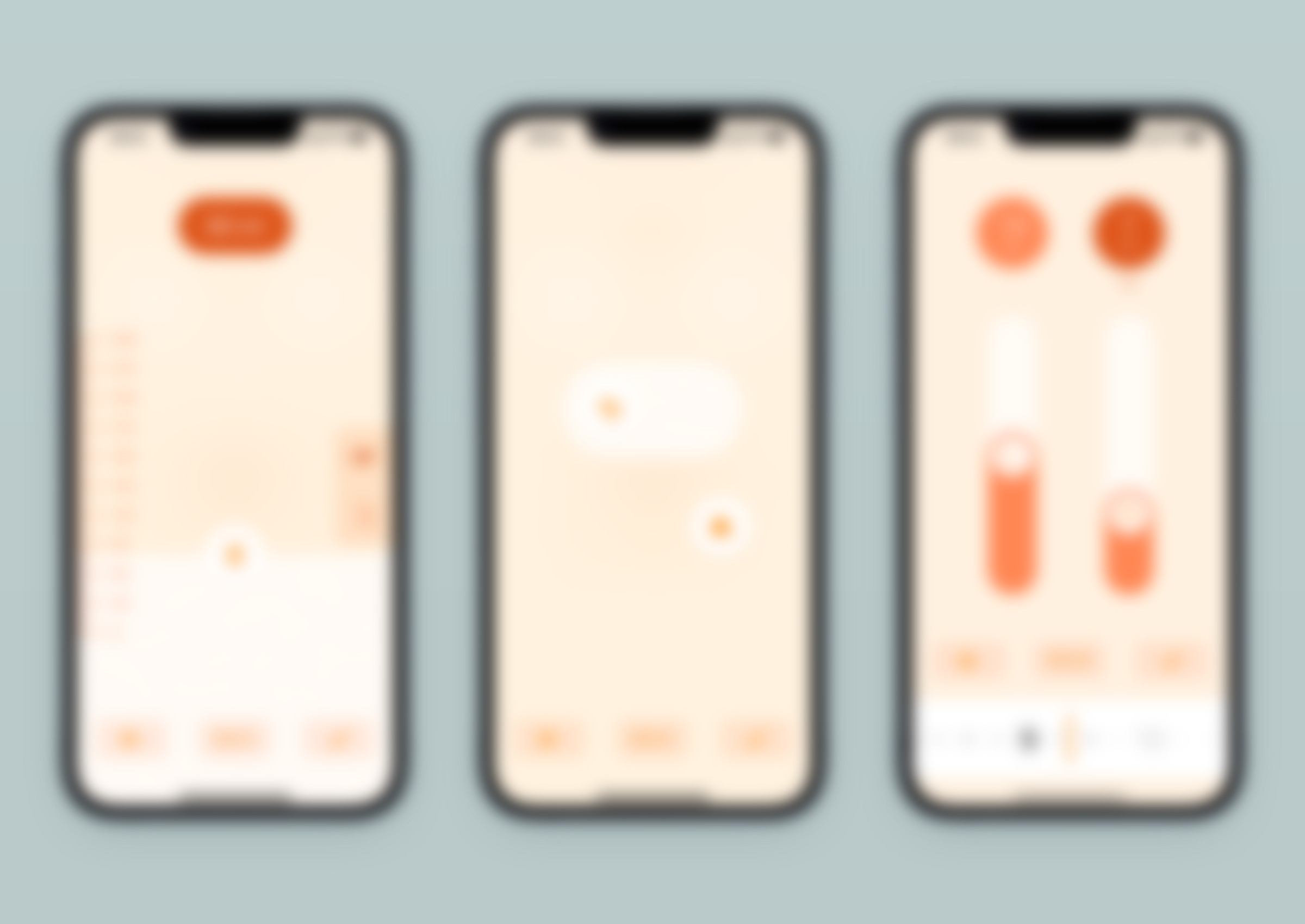
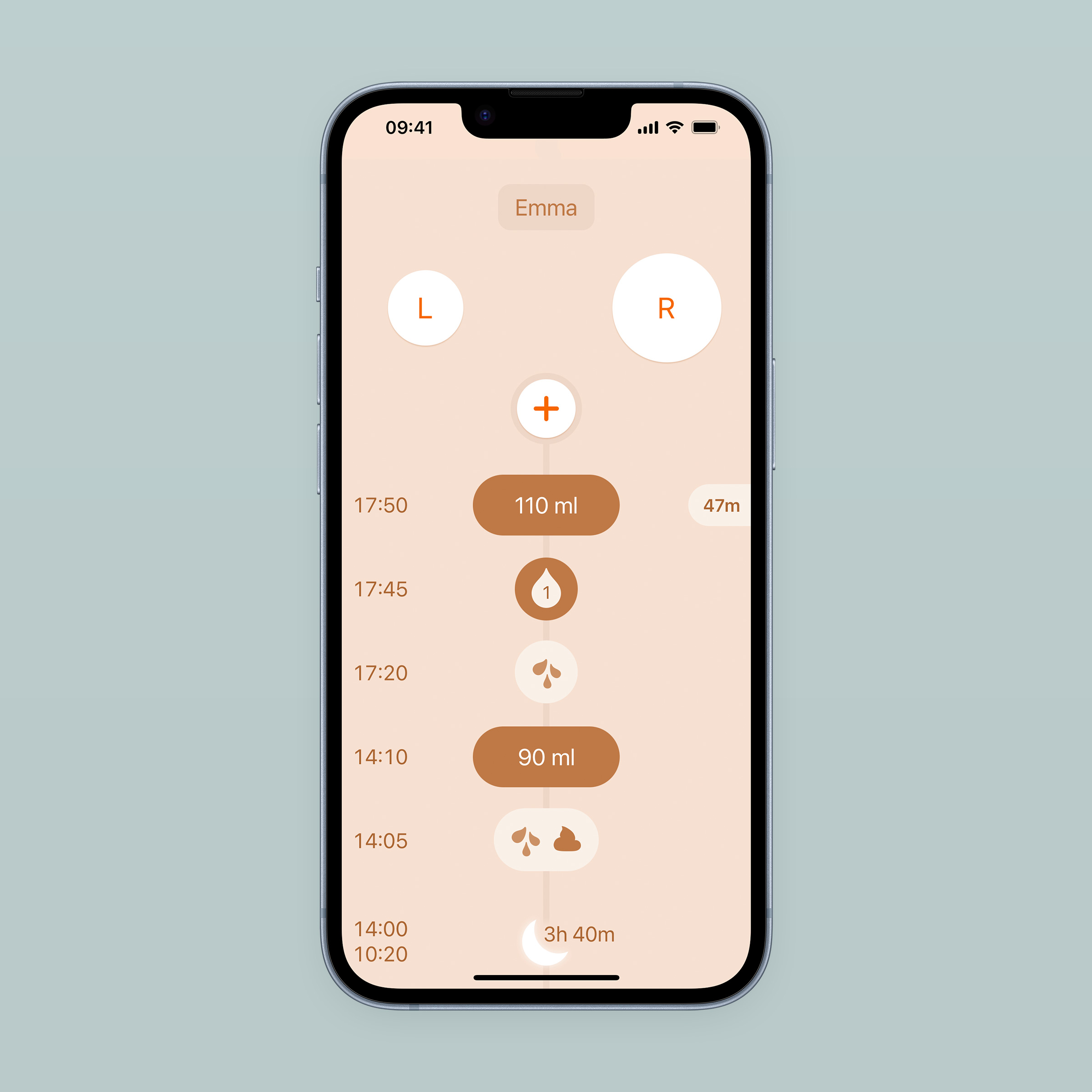
Si vous avez déjà accueilli un nouveau né à la maison, cette description devrait vous sembler familière. Et si vous aviez l’intention d’avoir des enfants, ne changez pas d’avis. C’est en tous cas le contexte d’usage typique de Le Baby. Son but est de permettre aux jeunes parents qui le souhaitent de noter les événements liés à l’alimentation, au sommeil et à la croissance de leur bébé, et de les consulter plus tard en cas de doute, par curiosité, ou lors d’une discussion chez le pédiatre (si cela vous parait suspicieux voire futile, cet article pourrait vous faire changer d’avis). Voici par exemple comment noter un changement de couche qui a eu lieu il y a 15 minutes, et un biberon de 120 ml que le bébé vient de vider :
Cette présentation rapide montre que Le Baby n’a pas été construit en utilisant les éléments natifs d’iOS. Chaque partie de l’article l’expliquera, dans un ordre qui ne reflète pas la chronologie de la conception : la prise en compte du contexte n’a pas précédé l’intégralité des choix ergonomiques, le langage formel n’a pas attendu que l’ergonomie soit finalisée pour être exploré. Tout s’est tissé en parallèle, chaque proposition étant évaluée sous différents angles et comme solution convenable aux différents points du cahier des charges.
Si vous avez un appareil iOS à disposition, je vous invite à installer Le Baby (gratuitement) pour avoir entre vos mains le sujet de cette lecture. Les captures d'écran qui suivent sont pratiques pour illustrer le propos, mais rien ne vaut l'original. La version de l’app à la publication de cet article est 3.4.1, et vous pourrez lire dans l’historique des versions ce qui aura changé depuis.
Collecter et restituer
Comme indiqué plus haut, Le Baby est fondamentalement un aide-mémoire. C’est un outil pour enregistrer de l’information, qui n’offre aucun autre contenu que les notes ajoutées par ses usagers. Chaque ouverture de l’app doit permettre d’emblée d’ajouter une nouvelle information à mémoriser, ou de passer en revue ce qui a été noté dans les heures/journées précédentes. On ouvre l’app pour noter la couche qu’on vient de changer ; plus tard, pour voir combien de temps s’est écoulé depuis le dernier biberon. Il n’y a pas de prépondérance de l’une de ces tâches sur l’autre, il faut pouvoir les réaliser toutes les deux dès le lancement de l’app, sans avoir à naviguer. C’est pourquoi l’écran d’accueil a été séparé verticalement en deux zones : le haut pour la collecte d’informations et le bas pour leur restitution.
Collecter l'information
Deux possibilités existent pour ajouter une information à mémoriser : l’un des deux boutons de raccourci en entête, ou le bouton (+) qui ouvre le menu donnant accès à tous les types d’entrée disponibles. Un réglage du journal concernant l’allaitement modifie le rôle des boutons d’entête :
À gauche, les boutons de raccourcis du haut pointent vers les entrées les plus courantes. À droite, ils ont été remplacés par le chronomètre d'allaitement.
Quand l’allaitement est activé dans les réglages, ces deux boutons deviennent un chronomètre permettant de mesurer le temps passé à chaque sein par le bébé. Cela permet de s’assurer que le bébé mange suffisamment en cas de doute, ou d’avoir un aperçu plus clair de son rythme d’allaitement. Il est accessible dès le lancement de l’app, indiquant par la taille des boutons quel sein donner à la tétée suivante (il est important d’alterner d’une session à l’autre). Son fonctionnement est détaillé plus bas.
Quand l’allaitement est désactivé dans les réglages, ces deux boutons sont des raccourcis vers les entrées de sommeil et de biberon. À terme, il sera possible de personnaliser le type d’entrée de chaque bouton.
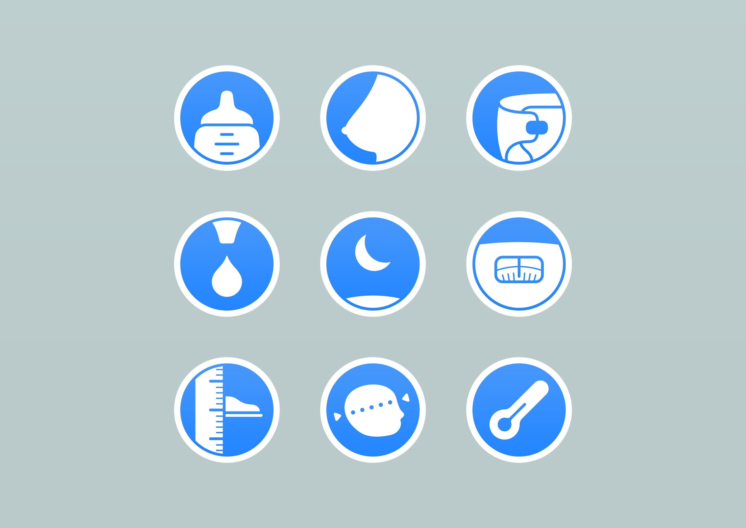
Le bouton (+) donne accès à tous les types d’entrées disponibles :
Page 1 et page 2 du menu des entrées.
Leur disposition a été définie en fonction de leur fréquence d’usage : dans la première page du menu se trouvent les entrées les plus utilisées, dans le deuxième les plus occasionnelles. La fréquence d’usage a aussi indiqué le classement vertical dans le premier écran pour que le pouce puisse tomber naturellement sur les plus fréquentes. Dans la beta de la v1.0, le menu avait un arrangement circulaire et les boutons n’avaient pas de libellés. J’avais choisi cette disposition car elle permettait une transition d’ouverture plaisante depuis le bouton (+), et n’avait pas ajouté de libellés car ils me semblaient redondants des icônes. Un échange d’email avec un Design Evangelist d’Apple plus tard, j’étais un meilleur designer qui avait compris qu’une composition comme celle-ci n’était pas performante, le bénéfice d’organiser les icônes en fonction de la fréquence d’usage, et la nécessité de libeller les icônes dans un tel contexte. Il a fait bien d’autres commentaires pertinents, dont beaucoup ont été pris en compte dans le produit que nous avons aujourd’hui. Conseil rapide : si vous avez l’opportunité d’échanger avec cette équipe d’Apple, faites tous les aménagements nécessaires dans votre emploi du temps pour qu’elle puisse avoir lieu.
Une première et peu judicieuse version du menu.
Dans cette même perspective de réduire au maximum le nombre de manipulations pour ajouter une nouvelle entrée, certaines entrées présentent par défaut la dernière valeur enregistrée plutôt qu’une valeur fixe. C’est très utile pour les biberons qui sont souvent du même volume quelques jours d’affilée : il n’est plus utile d’ajuster la valeur quand on en ajoute un.
Ca va vraiment très vite, 3 secondes, car le pouce reste au même emplacement pour sélectionner le biberon et valider l’entrée dans la foulée. Quand on sait que c’est aussi facile de noter un biberon, on est plus enclin à le faire tout de suite plutôt que de le reporter à un plus tard avec le risque d’oublier que cela comporte.
Restituer l'information collectée
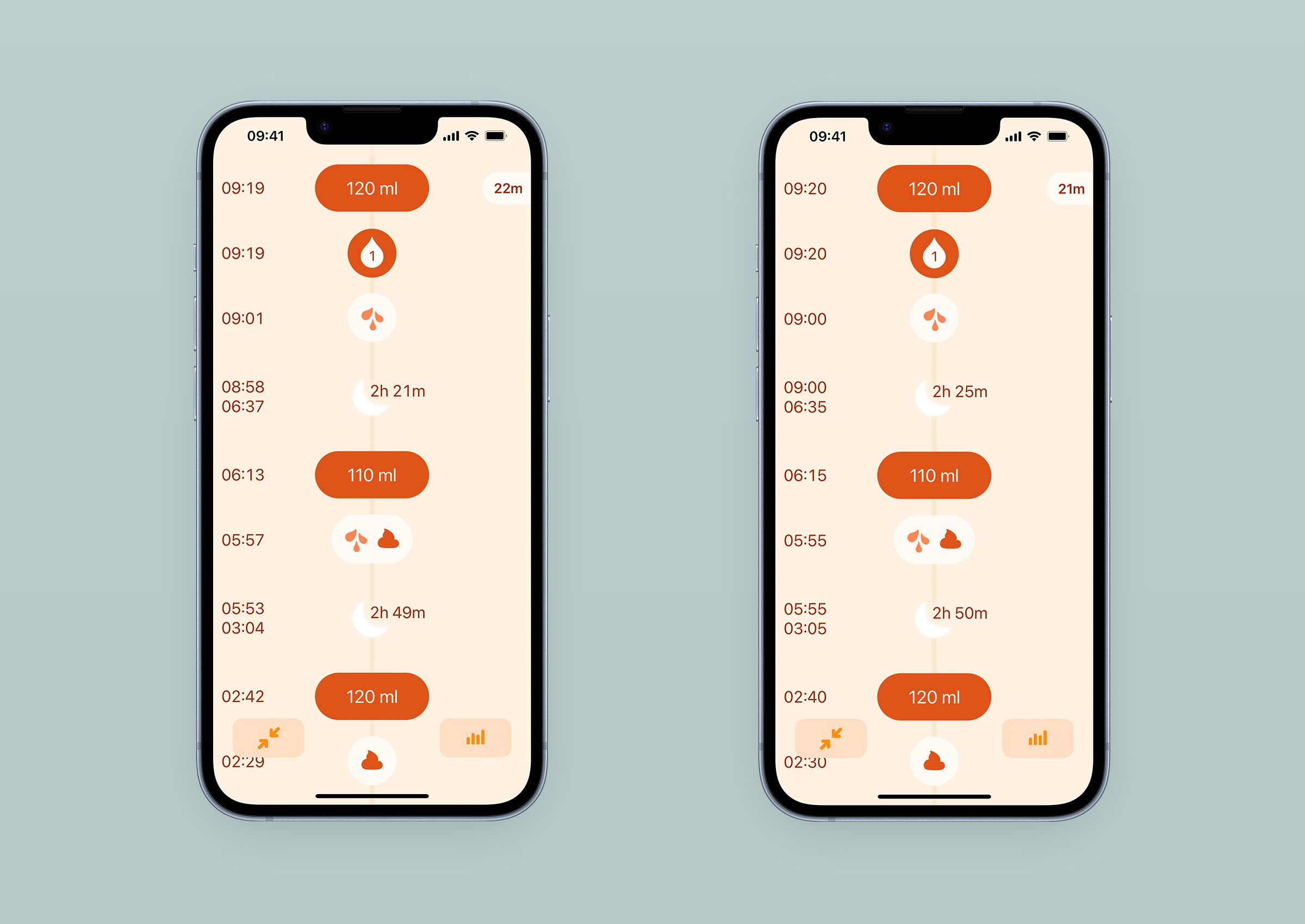
Dans la partie basse de l’écran principal, la liste des dernières entrées ajoutées répond à la question “qu’est ce qu’il s’est passé dans les dernières heures ?”, souvent initiée par une première “mais pourquoi ces pleurs ?”. Le fil du temps est représenté verticalement, démarrant du bouton (+) représentant le présent, et descendant jusqu’aux informations de naissance. Le nombre d’entrées visibles d’un coup d’œil au lancement de l’app dépend de la hauteur de l’écran offerte par l’appareil utilisé : 4 pour les écrans de 4,7 pouces, jusqu’à 7 pour les écrans de 6,5 pouces.
Il est possible de se plonger complètement dans la consultation des entrées en donnant une légère pichenette vers le haut. Elle amène l’entrée la plus récente tout en haut de l’écran pour qu’il soit rapidement et facilement possible de voir un nombre maximum d’entrées dans la hauteur de l’écran, et facilite le passage en revue des dernières heures pour les usagers qui ouvrent l’app pour ça.
Amadour avait suggéré ce comportement qui m’a surpris et dérangé dans un premier temps ; il est possible que vous ayez aussi cette réaction en l’essayant. Une gêne similaire à celle que l’on peut avoir quand une page web ne défile pas comme attendu - les pages de présentation des produits Apple en sont un parfait exemple. C’est moins dérangeant une fois qu’on a appris à l’anticiper, ce qui arrive rapidement avec une haute fréquence d’usage comme c’est le cas pour Le Baby. Ajoutons le bénéfice d’accéder rapidement à un détail plus complet des derniers enregistrements, et ça devient même agréable. Ce sujet est un très bon exemple de pourquoi il faut toujours questionner la gêne qu’on peut éprouver devant une proposition, et s’appliquer à expliquer l’origine de cette friction. C’est une habitude difficile à prendre, car elle est en concurrence directe avec le soucis d’efficacité qui nous fait appliquer des règles simples et efficaces acquises par l’expérience. Être conscient de ce qu’on éprouve, pouvoir en faire le tour, et savoir l’expliquer. Et être prêt à changer d’avis.
Lorsqu’une journée s’achève, les entrées sont rassemblées dans une carte de résumé quotidien présentant la somme des valeurs enregistrées. Au bout d’une semaine, un résumé hebdomadaire rassemble les sept jours passés et montre la valeur moyenne journalière des entrées enregistrées. Il est bien-sûr possible de passer des cartes de la semaine à celles des jours puis au détail des entrées, et inversement.
Une carte de résumé journalière montrant le total des valeurs enregistrées, suivie d'une carte de résumé hebdomadaire montrant les moyennes quotidiennes.
Le manque de sommeil
La perte de qualité de sommeil a pour les jeunes parents des conséquences très concrètes : la concentration et les capacités de réflexion sont affectées, alors qu’ils ont beaucoup à faire, beaucoup à apprendre. Peut-on dire qu’il ne faut pas trop leur en demander ? Oui. Pour être efficace, l’app doit exprimer succinctement et clairement ce qu’elle a à dire, et ne doit pas être exigeante sur le niveau de concentration requis pour être manipulée.
Signalétique et habitudes
Dans la taille d’écran offerte par un smartphone, et le contexte de fatigue des usagers, le cahier des charges est assez serré : il faut être explicite tout en optimisant la lisibilité des informations que l’usager recherche. Cela implique une taille de texte et des zones de réserve généreuses.
Utiliser des libellés pour être explicite implique une répétition contre-productive (biberon 90ml, biberon 110ml, couche mixte, sommeil 2h20, couche humide, biberon 110ml, biberon 70ml,…).
Pour éviter la présence d’une signalétique abondante, répétitive et donc peu utile pour une app utilisée plusieurs fois par jour(1), chaque type d'information présente à l'écran prend une forme distincte. Une entrée de biberon n'a pas la même apparence qu'une entrée de poids. Le bouton d'accès au menu n'a pas la même forme que le bouton d'accès aux réglages du journal.
Chaque type d'information a une forme distincte avec laquelle les usagers se familiarisent rapidement.
Simplifier l’apparence du produit pour en optimiser l’usage quotidien et répétitif nous a semblé plus important que de le rendre parfaitement explicite à sa découverte.
Demander à l’usager de prendre un peu de temps pour se familiariser avec l’app permet de la rendre beaucoup plus légère visuellement que d’autres apps concurrentes présentant le même contenu. Cette légèreté visuelle a un impact très positif sur la lisibilité des informations affichées, mais aussi sur la perception émotionnelle du produit. Les commentaires laissés par les utilisateurs sur l’App Store(2) mettent souvent en avant cette simplicité comme point fort de l’app. Ils indiquent aussi régulièrement la trouver intuitive. Ce sont des notions qui ont beaucoup de valeur dans ce moment où beaucoup de choses paraissent, et sont parfois, compliquées.
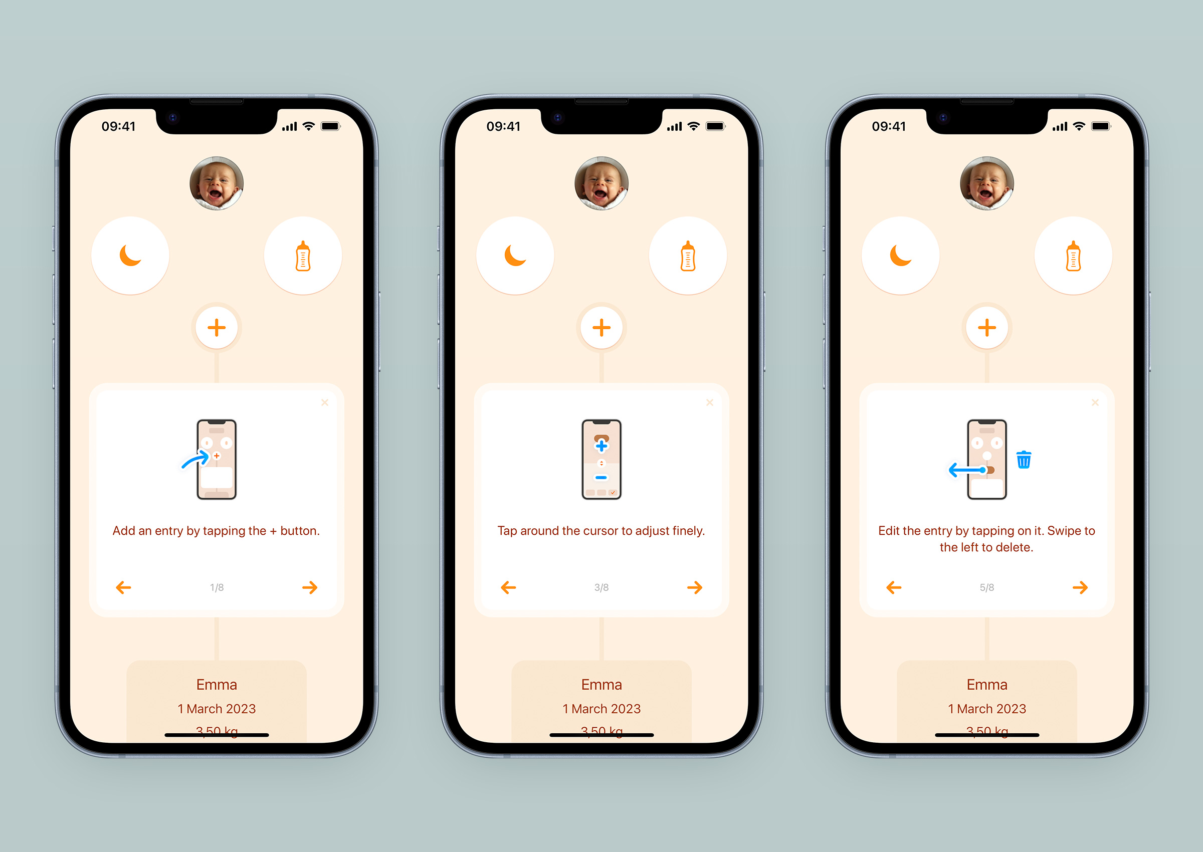
Néanmoins, il est essentiel de permettre aux personnes qui l’essaient de se rendre compte rapidement qu’elle est pratique à utiliser. Ces personnes sont fatiguées et n’ont pas que ça à faire. Pour construire ce pont entre perception initiale et efficacité au quotidien, un guide de démarrage en 8 étapes s’affiche en tête de journal au premier lancement de l’app, et peut être parcouru de façon asynchrone. Il est important de laisser à l’utilisateur la possibilité de progresser à son rythme, d’être interrompu (par un bébé demandant de l’attention par exemple), et stabiliser sa progression dans les étapes tout en lui permettant d’utiliser l’app. Les guides qui imposent leur consultation et leur complétion pour être fermés ne sont clairement pas indiqués dans ce contexte.
3 étapes du guide de démarrage qui s'affiche au premier lancement de l'app.
La première version de l’app n’avait pas de guide, mais un lien d’aide qui les amenaient vers une page de notre site. Les visites sur cette page étaient fréquentes, et quelques tests utilisateurs auprès de jeune parents nous ont fait comprendre qu’il fallait faire mieux. Dans notre quête de minimalisme - pour des questions de principe, mais aussi pour réduire l’effort de traduction - nous avons d’abord animé le bouton d’accès au menu - animation qui est toujours présente aujourd’hui. Il s’agite comme pour dire bonjour avec la main ; « c’est par ici que ça se passe ». Cela nous semblait suffisant pour mettre les parents sur la piste de l’ajout de leurs premières entrées. Erreur. Les tests utilisateurs suivants nous ont montré que nous étions trop optimistes, sans doute trop fiers d’avoir trouvé une solution maline à notre problème. C’était très pénible d’observer ces personnes rester sans rien faire devant cet écran qui nous semblait évident, mais qui pour eux était inhabituel, vide, atone, malgré ce petit bouton d’ajout central s’agitant devant eux. Une personne fatiguée et/ou pressée n’a pas le loisir de faire l’effort d’une interprétation conceptuelle aussi astucieuse soit-elle, et un libellé bien dimensionné dont les mots ont été choisis avec soin reste autrement plus efficace. C’est comme ça que le guide est arrivé dans l’app, et nous avons fait appel à des traducteurs pour l’adapter aux neufs langues que nous proposons.
La première version du guide était uniquement textuelle, et comportait 17 étapes. Nous les avons réduites à 8 et avons ajouté des illustrations pour le rendre plus agréable à consulter. Si besoin, il est possible de l’afficher plus tard depuis l’écran des réglages du journal.
Structure des écrans
L’autre décision qui a permis de favoriser la sensation de simplicité a été de donner aux écrans d’ajout d’entrée une structure constante : en haut la valeur de la nouvelle entrée, au centre la manipulation de cette valeur, et en bas la modification de l’heure, la validation de l’entrée ou son annulation. Dans ces écrans qui sont manipulés très régulièrement, favoriser la mémoire musculaire permet d’accroitre leur confort d’utilisation avec le temps.
Des écrans à structure commune pour la mémoire musculaire, mais visuellement distincts pour un feedback de navigation immédiat.
Autant la régularité de structure aide les usagers, il est aussi crucial pour eux qu’ils soient bien distincts visuellement. En cas d’erreur de sélection d’item dans le menu - quand on est fatigué, cela peut arriver - on s’aperçoit immédiatement qu’on a pris le mauvais chemin et qu’il faut faire marche arrière. C’est la zone dédiée à la manipulation de la valeur qui joue ce rôle de distinction, tout en participant à renforcer la personnalité de l’app. Là aussi, l’expression visuelle des types d’entrée est la plus simple possible, sans trop de détail pour préserver la légèreté perçue lors de l’utilisation.
Valeurs arrondies
Dans le souci d’apaiser l’interface et de réduire le bruit visuel, les valeurs enregistrées sont arrondies dans la limite de l’acceptable quant à la qualité du suivi. Lorsque l’heure de l’entrée est modifiée pendant la saisie, la granularité offerte par défaut est de 5 minutes. Les heures aux incréments de 5 minutes sont plus rapides et confortables à parcourir dans une liste que celles où ils sont d’une minute.
À gauche, les heures d'entrées normales. À droite, les heures vont de 5 min en 5 min, granularité par défaut à la modification. Le parcours vertical s'en trouve facilité.
Pour l’allaitement et le sommeil, les secondes ne sont pas prises en compte car elles sont marginales pour le suivi. Dans le chronomètre d’allaitement, les secondes passées à chaque sein sont toutefois affichées : leur défilement est une confirmation visuelle du bon fonctionnement, et elles peuvent s’additionner significativement quand le bébé passe plusieurs fois d’un sein à l’autre lors d’une même session.
Pour le biberon, le volume est arrondi à 10ml (0.2 fl oz) par défaut. Il est toutefois possible de l’ajuster au millilitre (0.1 fl oz) en tapotant de part et d’autre du curseur. Une interaction qui n’est pas évidente à découvrir, et dont nous avons prévu d’améliorer la mise en avant (la gestion de la roadmap sera abordée dans un futur article concernant les outils et les méthodes utilisées dans ce projet).
Des boutons de taille généreuse
Mises à part les apps Réveil et Téléphone, il n’y en a pas beaucoup qui doivent pouvoir être opérées avec succès immédiatement après un appel non sollicité au milieu de la nuit. Une app de suivi de bébé en est une autre. Pour augmenter les chances de réussite d’un ajout d’information dans ces moments là, la taille des boutons a été augmentée autant que possible, en équilibrant trois contraintes : le respect de la hiérarchie sémantique à l’écran, l’adaptation aux appareils de petite taille (4 pouces), et l’harmonie esthétique.
Les écrans d'entrées s'adaptent en fonction de la taille d'écran, et à la présence de la frise de modification d'heure.
Sont particulièrement concernés les boutons de raccourcis ou de chronomètre d’allaitement, les boutons du menu, et les curseurs de valeurs. Ce principe d’agrandir au plus la zone active est accentué dans les écrans de saisie du biberon, de la température et des mensurations, où toute la zone centrale est interactive. Peu importe où le doigt se pose à proximité du curseur, ça marche.
Une seule main disponible
Ce sujet provoque régulièrement un malentendu que j’aimerais écarter immédiatement : non, l’idée n’est pas de faciliter l’usage de Le Baby au point que les parents en négligeraient la sécurité de leur bébé. On imagine trop vite un parent marchant le regard vissé à son écran, alors que son nouveau né glisse doucement de son épaule sans qu’il ne s’en aperçoive.
Ceux qui ont été parents il n’y a pas longtemps le savent bien, et les hormones des autres ont effacé ce souvenir pour que l’espèce humaine puisse se perpétuer : un bébé demande une attention quasi constante, un contact physique presque permanent, et c’est normal. La conséquence pratique est qu’un parent n’a pas très souvent les deux mains libres, l’une d’entre elle étant occupée à rassurer le bébé. Quand on conçoit un objet qui s’utilise avec les doigts, c’est une contrainte qu’il peut être intéressant de prendre en compte.
Nous en avons fait un des fondamentaux de Le Baby : il fallait qu’une personne dotée de petites mains et d’un grand écran puisse utiliser les fonctionnalités principales de l’app avec le pouce, que ce soit de sa main préférentielle ou de l’autre. Le placement des interactions sur l’écran et la taille des zones actives sont le reflet de cette volonté.
La navigation, c'est en bas
Quelques années avant que la barre d’adresse de Safari et sa liste d’onglets ne soit déplacée au bas de l’écran, dans une avalanche de tweets outragés, les actions de navigation de Le Baby y avaient pris leurs quartiers.
À l’ajout d’une entrée, trois boutons se trouvent sous le pouce : annuler l’ajout, accéder à la modification de l’heure, valider l’ajout.
Les boutons placés à portée de pouce à l’enregistrement d’une nouvelle entrée, ou lors du parcours du journal.
Dans l’écran principal, lorsqu’on affiche le journal sur toute la hauteur de l’écran, deux boutons s’affichent en bas : celui de droite permet d’accéder aux graphes qui seront détaillés plus bas, et celui de gauche permet un retour à l’état initial du journal sans avoir à toucher la status bar (les premiers millimètres du haut de l’écran contenant l’heure, le niveau de la batterie et la qualité du réseau). Lorsque des résumés journaliers ou hebdomadaires déployés sont affichés à l’écran, ce bouton s’adapte pour permettre le repli des objets jours et semaines. Une fois que tout est replié, ou que les cartes déployées ne sont plus en vue, il revient à sa fonction initiale de retour vers le haut du journal.
Si vous souhaitez voir ces résumés fonctionner, voici un journal échantillon contenant plusieurs semaines de données que vous pouvez importer dans l'app(3).
Improving time edits
Avant d’expliquer pourquoi nous avons proposé une solution faite maison, je prends quelques lignes pour rendre hommage au composant natif d’iOS permettant l’entrée de dates et d’heures : ces petites roulettes verticales qui sont présentes depuis la première version. Malgré le peu d’affection qu’elles suscitent, elles sont à mon avis une des interfaces les plus réussies d’iOS. Elles offrent la possibilité de modifier les dates et les heures dans tous les formats internationaux existants dans la surface d’une demi-carte de visite, disponible pour toute app qui en aurait besoin. Quinze ans plus tard elles sont toujours là, dans une apparence régulièrement mise à jour certes, mais avec le même fonctionnement sous-jacent et la même modularité leur permettant de s’adapter à de multiples situations. Elles sont un excellent exemple de compromis : accepter quelques défauts en terme de maniabilité (il faut parfois s’y prendre plusieurs fois avant d’arriver à la valeur souhaitée) pour assurer une couverture fonctionnelle qu’on peut raisonnablement qualifier de vaste. Bravo à vous les roulettes, et à l’équipe qui les ont fait naître.
Notre contexte d’usage amène à devoir modifier l’heure plusieurs fois par jour, parfois suite à un réveil non sollicité : ces roulettes, aussi géniales soient-elles à l’échelle du système, nous ont semblé mal adaptées. Elles demandent trop de précision gestuelle, alors que l’usage le plus fréquent est un ajustement de quelques minutes, plus rarement de quelques heures.
Notre solution devait proposer la zone active la plus généreuse possible pour que la modification de l’heure puisse s’initier sans beaucoup de précision. Il fallait aussi que l’on puisse atteindre l’heure désirée avec le moins de gestes et de contrôle musculaire possible. Le format d’une frise continue a permis cela. Son échelle a été calibrée pour que l’on puisse se déplacer d’environ deux heures en déplaçant le pouce sur la largeur de l’écran. Sa célérité au déplacement a été finement ajustée par Amadour pour qu’il soit possible de se déplacer rapidement dans le temps en donnant des pichenettes vers la droite.
Initialement, nous n’avions pas donné la possibilité de choisir une date dans le passé avec un calendrier. Ce n’est pas le cas d’usage nominal, et nous avions beaucoup d’autres fonctionnalités plus essentielles à mettre en place. Pour ajouter une entrée plusieurs jours dans le passé, il fallait exécuter autant de pichenettes vers la droite que nécessaire. Amadour a fait en sorte que la vitesse de remontée dans le temps augmente avec le nombre de ces glissés, si bien que se déplacer de plusieurs jours était faisable, occasionnellement. Nous avons reçu le message d’un utilisateur qui nous faisait part de son inconfort à enregistrer les premières entrées faites dans une autre app. Apprendre que quelqu’un abandonnait une autre app pour la notre était une incroyable nouvelle, mais réaliser que nous ne faisions rien pour le faciliter l’était beaucoup moins. Le sélecteur de jour s’est soudainement retrouvé en tête de notre feuille de route. La date précisée au milieu de la frise est devenue un lien affichant un calendrier flottant natif. Beaucoup plus confortable, et ce sera également utile aux parents qui souhaiteront enregistrer à posteriori les différentes mensurations que nous venons d’ajouter.
Accès au menu
L’accès au menu des entrées est l’élément de l’écran d’accueil le plus en contradiction avec le propos de cette partie de l’article. Impossible pour le pouce d’une main de taille normale tenant le téléphone d’aller toucher ce bouton. Heureusement, il suffit de tirer le journal vers le bas pour faire apparaître le menu.
Là encore, le comportement n’est pas celui de l’actualisation des informations attendue lorsqu’on a devant soit une liste d’entrées classées chronologiquement, ce qui peut surprendre. Mais le bénéfice vaut vraiment le désagrément des premières manipulations, et l’usage répété fait rapidement entrer ce comportement dans le cadre du « normal » chez les usagers. Un peu comme le problème de la barre d’url de Safari dont on entend plus vraiment parler, finalement.
24 heures sur 24, 7 jours sur 7
L’usage de l’app à la suite d’un réveil inopiné a déjà été évoqué plus haut, donc vous l’avez sans doute déjà compris si ce n’est expérimenté : pendant plusieurs semaines, les pleurs du bébé peuvent retentir à tout instant et demander aux parents d’interrompre leurs occupations. Leur sommeil souvent, mais aussi une douche, la préparation du repas, une conversation téléphonique, une réparation de vélo. Bref, on n’est pas toujours préparé quand Sa Majesté vous somme d’arriver au plus vite. Cela veut dire qu’on a parfois pas la possibilité d’allumer la lumière, ou d’enfiler ses lunettes alors qu’elles nous sont nécessaires pour lire.
Sans lunettes
Étant porteur de verres correctifs depuis mon enfance, c’est un sujet auquel il m’a été facile d’être sensible. Pour ceux et celles qui ne le sauraient pas, lorsqu’on ne porte de pas ses lunettes de correction, un flou général d’installe ; les lignes fines disparaissent, les lettres des textes trop petits deviennent impossibles à distinguer les unes des autres, et les détails des formes se noient dans une masse approximative. Sans ses lunettes de vue, la plupart des apps deviennent inutilisables, mais il est possible d’arranger ça.
Deux tâches peuvent être amenées à être accomplies par les jeunes parents dans la précipitation, ne pouvant pas attendre de retrouver l’endroit où on a posé ses lunettes de vues en les retirant : lancer le chronomètre d’allaitement après avoir identifié le sein à donner, et consulter les toutes dernières entrées du journal. Savoir qu’un change ou un allaitement a eu lieu il y a quelque temps donne une première indication sur l’origine possible des pleurs du bébé.
Les valeurs ne peuvent être lues, mais la chronologie des types d’entrées ainsi que l’indication du sein à donner pour l’allaitement suivant sont accessibles avec une vision dégradée.
Dans l’écran principal, l’indication du prochain sein à donner par le chronomètre d’allaitement est toujours perceptible malgré un fort niveau de flou. Toute l’utilisation du chronomètre est possible sans y voir correctement : les deux seins sont identifiés par leur emplacement dans l’écran, celui qui est en cours d’enregistrement aussi puisqu’il vient se placer au centre, et l’état de pause est identifiable par le bouton de validation qui s’affiche alors au-dessous.
À gauche, le chronomètre d’allaitement mesure le temps passé au sein droit. À droite, il est en pause avec le bouton de validation juste en-dessous.
Pour aider à l’interprétation des dernières entrées du journal, deux choix ont été faits : différencier les types d’entrées les uns des autres par leur forme, et distinguer par une couleur de fond plus contrastée les entrées d’alimentation. Il est donc possible d’obtenir un premier niveau d’information sans même avoir lu la valeur enregistrée ou l’heure précise de l’enregistrement : un biberon a été donné, et juste avant une couche a été changée. Affecter une couleur différente à chaque type d’entrée aurait été très efficace, mais il aurait été beaucoup plus compliqué de produire des thèmes de couleurs différents, qui jouent un rôle important dans certains cas d’utilisation intense (voir plus bas).
Les icônes de types d’entrée ont été dessinées pour que les parties denses en aplat de couleur ne soient pas situées aux mêmes endroits d’une icône à l’autre. Il est possible de les distinguer les unes des autres lorsqu’elles sont floues.
Les icônes sont distinctes les unes des autres avec une vision floue lorsqu’on ne porte pas ses lunettes.
Une personne ne les ayant jamais vues ne pourra pas les comprendre en les voyant comme ça, et c’est très bien comme ça. Le but est plus qu’une personne les ayant déjà souvent vues puisse les identifier de mémoire et choisir celle dont elle a besoin. Et si l’utilisateur venait à se tromper d’icône, la composition distinctive de chaque écran de saisie lui permet de se rendre compte qu’il n’est pas là il le souhaitait.
Une vision floue n’empêche pas de distinguer les différents écrans d’entrée les uns des autres.
Le Baby offre la possibilité de modifier le thème de l’interface (détaillé plus bas), et l’un d’entre eux a été conçu en maximisant le contraste, le rendant plus adapté à ceux et celles d’entre nous qui n’ont pas la chance d’avoir une vision correcte.
À droite, le thème de couleur ayant le contraste le plus important.
Dans le noir
Dès la version 1.0 nous avons proposé un mode nuit dont le rôle est de minimiser la quantité de lumière émise par l’écran lorsque l’app est utilisée dans une pièce sombre. Premier bénéfice : l’utilisateur évite de s’éblouir alors que ses yeux s’étaient adaptés à la pénombre. Deuxième : l’autre parent qui dort éventuellement à côté a moins de chance d’être réveillé (si le bruit ne l’a pas déjà fait). Et troisième : le bébé n’est pas distrait par la lumière qui éclaire vers le haut le visage de son parent (il y a ici un potentiel de traumatisme visuel qu'on apprécie peut-être pas assez) et le plafond quand il se nourrit.
Comment est ce que ça fonctionne ? iOS ajuste en permanence la luminosité de l’écran en fonction de la luminosité ambiante détectée par l’appareil. Nous nous servons de cette fonctionnalité pour déclencher le passage en mode Nuit lorsque la luminosité de l’écran tombe en-dessous d’un certain seuil.
Initialement, il n’y avait que 6 thèmes de couleur différents, et un seul thème de nuit. L’introduction du Dark Mode avec iOS 13, un an après la publication de notre v1.0, aurait pu nous amener à ne plus proposer ce mode nuit, et le proposer en tant que variation Dark Mode de chaque thème. Mais les usages ne sont pas tout à fait les mêmes. Le Mode Sombre peut être activé automatiquement aux heures tardives de la journée, mais aussi toute la journée par préférence esthétique : il faut donc garantir une lisibilité de l’interface en Darl Mode dans un contexte lumineux. Cela demande d’utiliser des contrastes qui augmentent l’émission de lumière, ce qui ne respecte pas la promesse de notre Mode Nuit. La solution fut plus de travail, et proposer pour chacun des 12 thèmes un mode lumineux, un mode sombre, et un mode nuit.
Un des 12 thèmes de couleur avec ses variations en Mode Sombre et en Mode Nuit.
Nous en avons profité pour optimiser le Mode Nuit en réduisant encore la quantité de lumière émise par l’écran. C’est l’un des aspects de l’app que je vous encourage vraiment à essayer par vous-même si vous le pouvez, en manipulant la luminosité de l’écran. La représentation faite ici ne peut pas traduire son fonctionnement réel. Vous pourrez constater à quel point la quantité de lumière émise par l’écran en Mode Nuit est faible, comparé à l’affichage du Mode Sombre dans Mail ou Notes par exemple.
Continuité visuelle
Dans Le Baby, la navigation d’un écran à l’autre s’accompagne de transitions visuelles. Ces fondus permettent de faire de l’app un ensemble cohérent, réactif et organique, dont les écrans semblent s’articuler les uns aux autres. Le parcours dans l’app étant visuellement continu, les utilisateurs s’en construisent une image mentale plus facilement, ce qui accroit leur confort d’utilisation. Ces transitions jouent le rôle que peut avoir une reliure pour un document imprimé: elle fait d’une série de feuilles libres un objet fini, ordonné et articulé.
Si vous n’avez pas la possibilité d’essayer l’app, voici une vidéo (avec son) de deux minutes qui vous donnera un meilleur aperçu de la relation existante entre les différents écrans :
En architecture d’intérieur, pour faire comprendre subtilement que deux espaces distincts font partie d’un même ensemble, on leur applique un ou plusieurs attributs similaires ; cela peut être une hauteur de plafond, le revêtement des murs ou du sol, une palette de couleurs, la nature et/ou la disposition des accessoires, une qualité lumineuse, une ambiance sonore,… En passant d’un espace à l’autre, même par une porte fermée, on comprend que deux espaces qui nous étaient inconnus sont liés entre eux. Sans ces similitudes, on interprèterait ce passage comme une rupture, comme celui du hall d’un immeuble à une boutique.
La charte graphique d’une app est un outil qui au-delà de son rôle d’identité visuelle, rassemble une série d’écrans dans un ensemble cohérent. Aussi déterminante qu’elle soit, c’est une méthode statique héritée de l’impression qui ne tire pas profit de la dimension temporelle des interfaces numériques pour produire du sens. Le comportement qu’il est possible de donner à certains éléments comme les boutons ou les blocs de contenu met en œuvre cette troisième dimension pour exprimer la relation à une unité : un bouton peut plus ou moins rebondir, un texte arriver en se déplaçant d’une certaine façon. Mais cette expression se limite aux contours de l’écran unique, et malgré leur présence, passer d’un espace à l’autre offre la même expérience visuelle que de passer d’une chaine de télé à une autre avec une télécommande. Certes, c’est réactif et immédiat, mais c’est un peu sec.
Au niveau du système, iOS opère une transition visuelle entre l’icône d’une app et son interface lorsqu’on la lance, et inversement lorsqu’on la ferme. Cela aide à mieux percevoir d’où on vient et où l’on va. À l’échelle de l’app, Photos fait de même lorsque vous passez de la pellicule à un cliché. Le parcours dans les apps Réglages et Mail utilise des transitions d’opacité, de position et d’échelle opérées entre un écran de départ et un écran de destination. Mais cela reste une approche très légère par rapport à notre expérience des espaces physiques et de notre perception d’une continuité de l’un à l’autre. Il y a une raison à cela : c’est bien plus difficile à mettre en place dans une app que de poser une moquette ou un modèle d’applique au mur.
Travailler avec Amadour Griffais a été déterminant pour que le parcours entre les écrans puisse exister tel qu’aujourd’hui dans Le Baby. Il faut posséder plus que des capacités techniques pour affronter la complexité qu’impliquent ces transitions et se lancer dans leur mise en place. Il faut aussi une bonne dose de patience, de rigueur, de méthode, et avant tout une réelle sensibilité à ce sujet. Il faut être convaincu de l’importance qu’ont ces transitions dans l’expérience d’une app pour mobiliser son savoir-faire et employer son temps à les mettre au point. De mon côté, au-delà d’avoir eu l’envie de voir ces écrans évoluer de cette façon, je n’ai fait qu’illustrer des intentions à l’aide de transitions entre diapositives dans Keynote. Rétrospectivement, il est fort possible que ces idées soient restées à l’état de maquettes et que Le Baby n’ait jamais vu le jour si je n’avais pas croisé Amadour dans mon parcours professionnel.
Les premiers croquis de l'app datant de 2012, deux ans avant de rencontrer Amadour.
C’est un fait dont peu de designers parlent, en tous cas dans les lectures que je peux croiser : sans ingénieur capable de construire ce qui est esquissé, de mettre en place les conditions techniques pour qu’elles puissent être exécutées, les maquettes que nous faisons, aussi léchées soient-elles, ne sont que des lettres au Père Noël. Sans données propres et structurées, impossible de présenter la bonne information au bon moment, ou de s’adresser de façon pertinente à l’utilisateur. Sans un développeur sensible aux apparences et au comportement d’une interface, doté d’un minimum de culture graphique, il est très compliqué - coûteux en temps et en nerfs - d’avancer dans un chantier à la vitesse requise par les attentes des usagers. Sans temps laissé au développeur doté de ces sensibilité de s’occuper des ces aspects, il n’est pas possible de les mettre en œuvre correctement.
Voici d’autres exemples de ces transitions au ralenti. Rien de très compliqué visuellement parlant, mais les développeurs iOS parmi vous auront sans doute un autre ressenti (tout est en Objective C).
Au delà de l’apport de sens et de confort à l’app par leur présence, ces transitions rendent particulièrement plaisantes la cinématique d’arrivée des entrées dans le journal. Lorsqu’on valide une nouvelle entrée, c’est la valeur qui vient d’être ajustée qui se dépose dans le journal, où un espace lui a été préparé juste avant. Il n’y a pas de « retour » vers une liste enrichie d’un item apparu en douce, depuis une modale de saisie comme c’est en général le cas (l’app Calendrier d’iOS par exemple). On progresse vers le journal enrichi avec la valeur de l’entrée qu’on a choisie comme fil conducteur visuel. Lors des premières minutes d’utilisation, ce fonctionnement informe l’organisation antéchronologique du journal.
Un autre exemple où la continuité visuelle est mise au service de l’usage : le chronomètre d’allaitement. Précision pour celles et ceux qui ne seraient pas au fait : il aide les mères qui allaitent à faire le suivi du temps total passé au sein pour s’assurer que le bébé mange suffisamment, et à se souvenir du sein où le bébé a passé le plus de temps à la dernière tétée - c’est important d’alterner pour que la production de lait se maintienne.
Les transitions aident à mettre en avant le côté en cours d’enregistrement en le déplaçant au centre de l’écran. Tout comme le bébé se déplace d’un sein à l’autre, le chronomètre déplace ses boutons lors de son fonctionnement.
Les fonctions esthétiques
Jusqu’à maintenant, les explications sur l’interface de Le Baby n’ont concerné que la disposition, la taille et le contraste des éléments qui la composent. Des aspects quantifiables et tangibles qui s’argumentent objectivement. Mais sa perception et son usage sont aussi informés par ses attributs esthétiques qui peuvent être plus subjectifs.
Placer d’un côté les choix “rationnels” et d’un autre les choix “émotionnels”, voire donner plus d’importance à l’un qu’à l’autre, n’a pas de sens puisque les deux s’influencent réciproquement dans le produit final, qu’on le veuille ou non. Je vous laisse extrapoler sur ce que je peux penser de la distinction qu’on nous impose depuis des années entre deux pratiques soit disant distinctes du design qui commencent par un U et finissent par un X ou un I.
Les attributs formels d’une interface vont susciter des émotions, souvent subtiles, qui vont associer chez l’usager le produit à un univers culturel identifié, qu’on l’ait anticipé ou non. Loin de moi l’idée qu’il soit possible de prévoir tout ce que les utilisateurs vont ressentir en manipulant un produit. En revanche, en étant conscient des choix d’ordre formel, il est possible d’anticiper les rapprochements à des univers émotionnels donnés, ou en tout cas de ne pas favoriser les associations à ceux qu’on préfèrerait éviter. On pourrait tout à fait prendre le cahier des charges détaillé jusque maintenant et faire de Le Baby une app surf, cyberpunk ou baroque. En étant moins caricatural, il serait possible de donner un caractère traditionnel, enfantin, médical, technique, ou encore kawaii à une app de suivi de bébé pratique à utiliser. Mais ce n’est pas ce qui a été fait. Les intentions pour Le Baby étaient d’exprimer la douceur, la simplicité et l’harmonie.
Douceur
Dans l’univers des bébés, la rugosité se vend mal. Tout ce qui touche au bébé est doux, et il serait risqué de ne pas s’inscrire dans cet univers là. Les parents font face à suffisamment de friction au quotidien pour qu’on leur en épargne quand c’est possible. C’était donc important que l’app exprime autant que possible le calme et la sérénité, pour que les parents puissent en recevoir une petite dose de temps en temps.
Dans l’interface, la douceur est exprimée avec le choix des couleurs pastel (plus de détails dans la partie dédiée à l’appropriation ↓), avec les lignes organiques du dessin des icônes, avec le réglage des animations, et aussi par le traitement visuel des graphes.
Icônes pour le menu.À gauche, la courbe de poids avec les percentiles de référence de l’OMS. À droite, le graphe de routine 24h montrant l’évolution de l’heure des biberons et des siestes dans la journée.
Simplicité
C’est l’une des lignes directrices du projet, et la promesse fonctionnelle de l’app ; cela semblait pertinent qu’elle fasse partie de son apparence.
Le peu d’éléments à l’écran induit déjà l’idée de simplicité, qui est renforcée visuellement par l’utilisation de lignes géométriques dans les objets fonctionnels de l’app. Boutons, délimitations de sections, icônes de service sont dessinés en utilisant des cercles et des rectangles aux coins arrondis, avec le moins possible d’interruptions et d’angles aigus.
La police de caractère utilisée dans une app a une influence majeure sur la perception émotionnelle qu’on peut en avoir. Au démarrage du projet en 2014, j’avais sélectionné Avenir comme fonte pour l’interface. Son dessin clair, moderne et généreux correspondait à ce que je voulais véhiculer. Et faisant partie des fontes installées par défaut dans iOS, avec six variantes de graisse, elle permettait une belle marge de manœuvre dans l’expression graphique, sans que le poids de l’app n’ait à en souffrir.
Maquettes initiales de 2014.
Lorsque nous avons repris le projet en 2018, San Francisco avait remplacé Helvetica Neue comme police de caractère par défaut d’iOS. Elle était à ce moment la seule fonte native offrant la possibilité d’adapter à peu de frais la taille des textes d’une app en fonction des préférences définies dans les réglages système. Nous avons donc abandonné Avenir pour San Francisco. Ni l’une ni l’autre ne sont à mes yeux la fonte idéale pour Le Baby, mais elles ont été celles qui s’en sont le plus rapprochées. Cela illustre bien le contrôle relatif qu’un designer peut avoir sur la matérialisation d’une intention esthétique. Là aussi, savoir faire des compromis est essentiel pour avancer.
Harmonie
Comme évoqué en introduction, le quotidien des jeunes parents est souvent sans dessus-dessous dans les premières semaines. Le Baby leur permet de clarifier le déroulement de leurs journées, en présentant un reflet ordonné de ce qui s’est passé. Les événements y sont explicites, distincts les uns des autres, énoncés dans leur chronologie.
Cet espace de référence où l’on vient chercher équilibre et harmonie serait moins convainquant si ces notions n’étaient pas perceptibles visuellement. La composition en symétrie axiale de la plupart des écrans participe à évoquer ce sentiment. Au niveau des couleurs, seules deux teintes sont utilisées dans les écrans : la principale pour presque toutes les couleurs, et une autre pour l’accent. Utiliser cette palette restreinte, qui plus est très largement pastel, participe à faire de Le Baby un espace calme et équilibré.
Appropriation
J’ajoute un dernier point avant de conclure cette partie dédiée aux choix formels. Très tôt dans le projet nous avons offert aux usagers la possibilité de choisir la couleur principale de l’app. Un choix formel (limité, certes) laissé à la discretion de l’utilisateur, où sa préférence personnelle peut s’exprimer. Le thème présenté par défaut quand on installe l’app a cette couleur qu’on appelle souvent “nude”, notion toute relative.
Le thème de couleur par défaut de Le Baby.
C’est une teinte souvent utilisée par les services ou produits liés à la grossesse, la maternité et la petite enfance. Elle me paraissait donc être une bonne référence de départ. Personnellement, je ne suis pas très fan, et c’est sans doute pour ça que j’ai pensé à proposer quelques variations.
Palette des thèmes de couleur de Le Baby.
Tous les écrans sont composés avec neuf couleurs : noir, blanc, principale, claire, sombre, foncé, plus foncé, très foncé, et accent. Un exercice de contrainte qu’avec le temps j’ai fini par regretter car il me limite énormément le champs des possibles lorsque je travaille sur de nouveaux thèmes. En effet certaines références sont utilisées à la fois en aplat et pour des textes, ce qui rend très compliqué de proposer des thèmes qui soient plus dynamiques et plus contrastés que ceux qui sont disponibles aujourd’hui. Le nombre de ces références et les éléments auxquels elles sont associées fait qu’on ne peut pas vraiment faire autre chose que des thèmes pastel. J’ai retenu une leçon, et depuis je commence toujours mes projets d’interface avec une large palette de variations dans laquelle piocher ensuite.
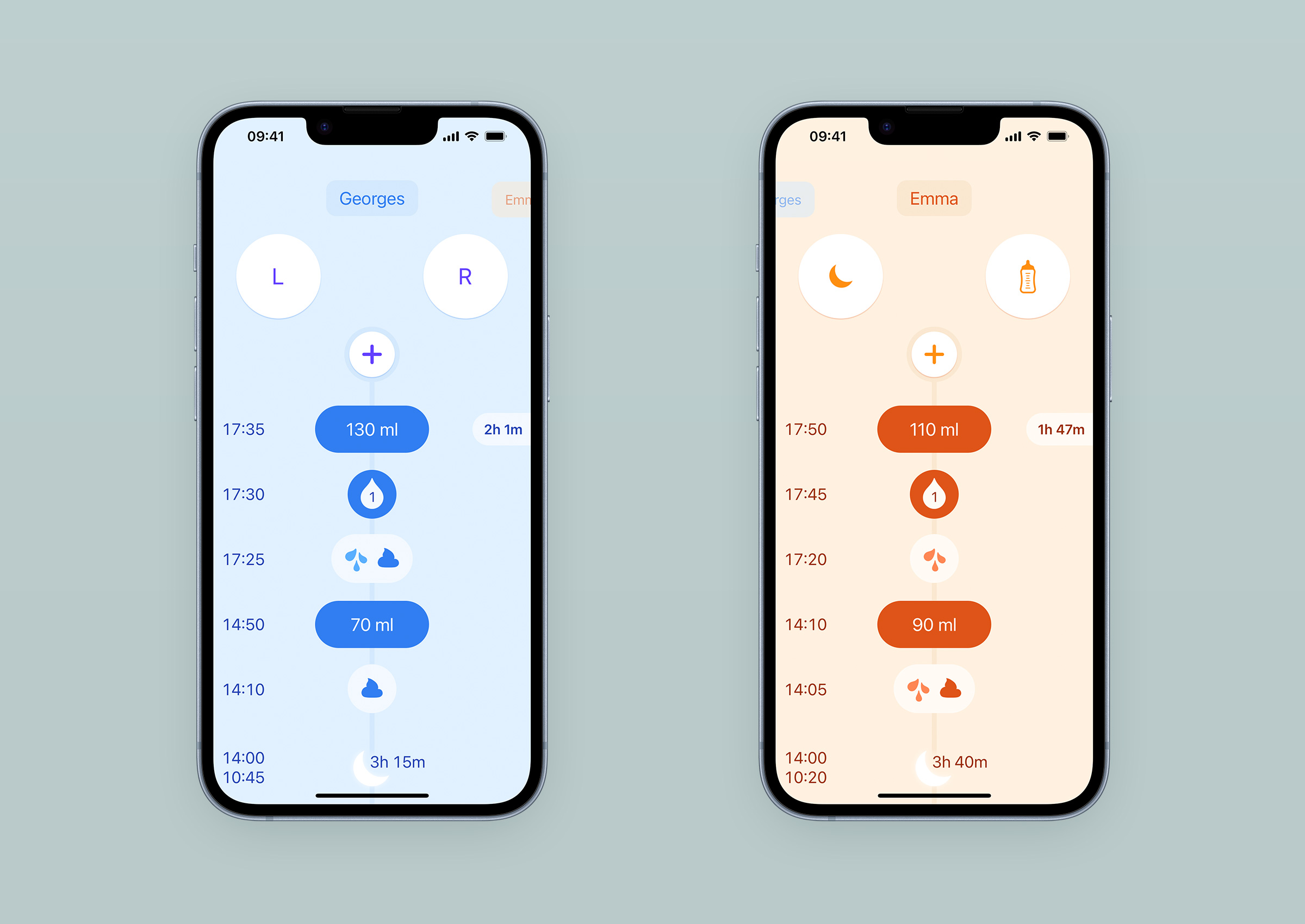
L’existence de ces thèmes permet aux parents de jumeaux et de triplés de les différencier immédiatement au lancement de l’app, que ce soit en mode jour, en mode sombre ou en mode nuit.
Les thèmes de couleur sont très utiles aux parents de jumeaux car ils leur permettent de distinguer immédiatement le bébé où qu’ils soient dans l’app.
Ce que deviennent les données
Le Baby affiche les données collectées par les parents à deux endroits : dans le journal et dans les graphes. Le journal leur donne à voir facilement ce qui s’est passé à l’échelle de la journée. Les graphes leur offrent une vue synthétique des enregistrements sur une plus longue durée. Les données demeurent privées, même pendant la synchronisation entre plusieurs appareils.
Vie privée
Nous ne savons rien.
C’est une notion qui n’a pas de présence physique dans l’interface, mais qui a une empreinte importante sur la nature de l’app, et qui influence son usage.
Amadour et moi sommes depuis longtemps convaincus que le respect de la vie privée est aussi important dans les produits numériques qu’il peut l’être dans notre environnement physique. Dès le début, nous avons considéré que nous n’avions aucun droit de regard sur les données que les parents ajoutent au journal de leur enfant. Nous avons souhaité que, par défaut, Le Baby se comporte comme un carnet de notes en papier, où ce qu’on y écrit ne peut pas être lu par son fabricant. Les données sont enregistrées sur l’appareil de l’utilisateur, et n’en sortent qu’avec sa participation active. Il y a trois possibilités pour les données enregistrées de se retrouver en dehors de l’app : un export sous forme de fichier CSV, une sauvegarde automatique dans l’espace iCloud de l’utilisateur, et la synchronisation avec un ou plusieurs autres comptes iCloud.
La réputation des apps est aujourd’hui telle que malgré les arguments de protection de la vie privée présents sur le site l’app et sur sa page de description sur l’App Store, nous avons découvert en échangeant avec des utilisateurs que certains restaient a priori méfiants du devenir des informations qu’ils confiaient à Le Baby. Exemple : ne pas avoir ajouté la photo du bébé au journal par crainte de perdre le contrôle de sa diffusion. Nous n’avons pas eu de retour sur les notes écrites précisément, mais en extrapolant il est probable qu’une partie des utilisateurs de Le Baby ne les utilisent pas ou les utilisent moins qu’ils le souhaiteraient, anticipant qu’elles puissent être exploitées par nous ou d’autres. Il faudra sans doute que nous exprimions plus clairement dans l’app que c’est un espace strictement privé où les utilisateurs ont la liberté d’ajouter ce qu’ils veulent.
Graphes
Initialement, je ne souhaitais pas ajouter de graphes dans Le Baby, pour deux raisons principales. Premièrement, je trouvais qu’ils déshumanisaient la relation entre un jeune parent et son bébé. Représenter les habitudes d’un nouveau-né en abscisse et en ordonnée comme on le fait pour les résultats d’une campagne marketing me semblait aller à l’encontre de l’objectif de l’app qui est de rappeler aux parents ce qui s’est passé pour qu’ils calibrent leur ressenti et finissent par avoir confiance en leurs observations. Deuxièmement, je redoutais que certains parents soient tentées de se fier aux courbes plus qu’à leur ressenti pour prendre leurs décisions quant aux soins à apporter. Les graphes peuvent induire l’existence d’une norme, d’un objectif à atteindre, alors que chaque bébé a son propre rythme, et qu’il est important pour son bien-être de le respecter.
Amadour était beaucoup plus enthousiaste que moi à l’idée d’ajouter les graphes : les informations collectées sont dans le journal, les parents ont fait l’effort de les collecter, pourquoi ne pas les représenter de façon plus digeste et ainsi les rendre encore plus utiles ? Presque toutes les apps concurrentes en proposaient, et quelques utilisateurs nous les demandaient. Nous avons fini par les ajouter, mais il était important pour moi que l’accès ne se trouve pas au premier plan, et que leur rendu soit aussi peu scientifique, précis et froid que possible. Naviguer entre le détail des entrées et les graphes est un vrai plaisir, ces deux représentations parallèles étant synchronisées. Ce spécimen de journal vous permettra d’en faire l’expérience vous-même si vous le souhaitez.
L’accès aux graphes n’est pas au premier plan, à dessin. Le bouton n’apparait que lorsqu’on commence à parcourir le journal.
L’année dernière, nous avons ajouté les graphes de routine qui permettent d’observer ensemble et d’un coup d’œil l’évolution des habitudes de sommeil et d’alimentation du bébé. Petit à petit, on voit les nuits s’installer et le rythme des repas gagner en régularité. Voici un exemple tiré d’un vrai journal qu’un utilisateur qui nous avait contacté a accepté de nous partager :
Chaque graphe est exportable en image png. Oui, ces parents ont eu la chance d’avoir des nuits décentes aussi tôt.
Une vue hebdomadaire de ces graphes est là pour qu’il soit possible d’observer des tendances dans la largeur d’un iPhone. Ces vues n’ont pas été faciles à dessiner, tant du point de vue visuel que du traitement de la donnée. La composition des thèmes de couleur a imposé l’utilisation des formes et de la transparence pour différencier les types d’entrée, et non de la teinte. Ensuite, représenter une activité moyenne pour une heure donnée de la journée nous a demandé d’établir des seuils et de décider de ce qui était négligeable. Je ne vais pas rentrer dans les détails, mais nous avons essayé pas mal de recettes avant celle qui se trouve aujourd’hui en production.
Une vue hebdomadaire des graphes de routine est disponible pour les journaux couvrant une grande période. Ils montrent l’intensité moyenne d’un événement pour chaque heure de la journée sur une semaine.
Derrière cette image se trouve une histoire, des moments intenses. Malgré son apparence analytique, c’est une représentation d’un vécu que les parents verront sans nul doute avec beaucoup de nostalgie dans quelques années. Le risque que ces graphes tentent certains à nourrir leur bébé à une fréquence donnée pour une quantité donnée existe, et reste pour moi un problème à résoudre. Mais ils offrent aussi un aperçu pertinent des premières semaines avec un bébé impossible à obtenir autrement. Finalement, je suis plutôt content que nous les ayons ajoutés.
Partage du journal
Quand les parents se passent le relais dans les premiers jours, être à la page sans avoir à déranger l’autre leur est très très utile. C’est ce que permet la synchronisation du journal entre différents appareils. Initialement absent de notre feuille de route, il est rapidement devenu un sujet déterminant pour le futur de l’app. Cette omission initiale peut s’expliquer très simplement : mettre en place une synchronisation de données est un chantier technique majeur, long, et toutes les solutions sont un compromis à multiple facettes entre protection des données, fiabilité, facilité de mise en place, et effort de maintenance. Annoncé en septembre 2021, iOS 15 a apporté un lot de nouveautés à iCloud qui nous ont permis de proposer une synchronisation simple à mettre en place par les utilisateurs, chiffrée de bout en bout, et nous offrant le luxe de ne pas avoir à gérer de serveurs nous-même. Le compromis est que lorsque ça ne fonctionne pas normalement, nous n’avons aucun levier d’action - nous venons de le vivre avec iOS 16.3 qui a introduit un bug dans la résolution de conflit. La mise en place n’a pas été clé en main pour autant, et a demandé un effort considérable car la documentation n’est pas encore exhaustive. Mais lorsque ça marche, c’est un vrai coucou suisse.
Du point de vue de la conception d’interface, le partage est assez transparent : seule une petite icône sur la droite du prénom indique qu’une synchronisation est en cours, ou a échoué. C’est l’exemple parfait de ces fonctionnalités où le nombre d’heures de développement est inversement proportionnel à l’empreinte en pixels sur l’écran. L’occasion aussi de rappeler que le design d’un produit va au-delà de son interface. Le bénéfice pour les usagers s’est assez rapidement et clairement exprimé dans les commentaires, particulièrement pour les parents de jumeaux.
Conclusion
Aussi long que cet article a fini par devenir, il y aurait encore beaucoup de précisions à apporter et d’aspects à creuser pour parcourir vraiment l’ensemble des décisions prises sur ce projet. L’app est encore loin d’être finie avec quelques points faibles à retravailler, donc il est possible qu’il y ait une suite à cet article. Ceci étant dit, si vous souhaitiez avoir plus de détail sur un aspect en particulier, n’hésitez pas à prendre contact, je ferai de mon mieux pour répondre.
Les retours des utilisateurs de Le Baby est globalement plutôt bon. Sur l’App Store, la note est de 4,8 sur 5, et les commentaires sont positifs. Les critiques sont centrées sur ce qu’il manque, plutôt que sur des défauts de fonctionnement de ce qui est proposé pour le moment. Lire qu’un usager trouve de la valeur et du plaisir à utiliser ce que vous leur avez mis à disposition est une vraie récompense.
Chaque projet est l’occasion d’apprendre de nouvelles choses. Avant de commencer à travailler sur Le Baby, je savais qu’un observation attentive du contexte d’usage peut amener à des nouvelles idées et de bonnes solutions. Ce projet m’aura appris beaucoup de petites choses, mais voici les deux principales que je retiendrai ici : les problèmes d’accessibilité peuvent être temporaires pour les usagers, et rester concentré sur une poignée de principes forts initiaux permet d’accomplir un bon travail. J’espère que cet article vous aura permis de faire quelques découvertes et qu’il aura été digne du temps que vous avez passé à le lire. Le prochain article sur Le Baby que je publierai ici parlera de son identité graphique, suivi par un autre sur les outils que j’utilise pour ce projet.
Dans les 30 derniers jours, les statistiques d’usage qu’App Store Connect nous transmettent indiquent de 10 à 15 sessions (d’au moins 2 secondes) par jour, avec une moyenne à 13.↩
La grande majorité de nos usagers sont en France pour le moment, malgré le fait que l’app soit traduite et présentée sur l’App Store, copies d’écran pour 4 tailles d’écran, en 9 langues. Donc la plupart des commentaires laissés sur l’App Store ne sont visibles que par les personnes ayant un AppleID français.↩
Une fois le fichier csv ouvert, accéder à la feuille de partage. Le Baby devrait être listée dans les apps compatibles. Touchez l’icône, et vous devriez ensuite voir un écran de validation d’import dans l’app.↩
In two weeks from now, it’s very likely that we will have spent 24 hours knowing about the first(1) bricks of Apple’s augmented/mixed reality ecosystem.
Most of the rumours focus on the headset itself, but it’s the OS that I can’t wait to find out about. The industrial designer in me is impatient to know about the solutions they came up with to make it a great product fit for most of us, and the design language it will bear. The AirPod Max has a direct shape filiation with the Watch, but wrapping around the face is a different challenge than covering a set of ears. It might be a moment where the Industrial Design team introduce new shape and material features rather than sticking to the ones we’re used to.
The OS will probably be a complete novelty. The keynote this year may well be one of these rare moments where we get to learn about new interaction metaphors and new ways to interact with information. What’s the equivalent of the desktop? How are we going to select, group, delete, add, browse lists, locate, search, read, and write? I expect eye and finger tracking to be close to magical, as it will be the basis for a fluid relationship with these new metaphors. If the headset ends up projecting content in our immediate physical space one way or another, which I intensely hope it does, the way content and space relate to each other is another aspect I’m impatient about. Can you anchor content to a room, an object, a moving object? Can you associate content to a specific AirTag and gift it to someone? Can you share or send your physical space? Can you use other existing devices such as the Watch, the AirPods and cameras on your iPhone and computers to enrich your experience? What does Time Machine look like? Another aspect I’m expecting a lot from is the integration of these new metaphors with our physical space. To blend in, these objects will have to be shaped and rendered in a way that our brain will understand them as a legit part of the physical world as we know it. But having them behave like real world objects would also be dull. How far interaction designers went to make them feel magical and totally obvious at the same time (as they did with the Dynamic Island for example), that I’m very curious about.
Potential use cases have also been commonly commented about these past weeks, expressing many doubts. It will very much depend on the field of vision the headset will provide: the wider it is, the more use cases will be possible. It might be that I’m blinded by excitement, but from my point of view, there is so much to be done. Imaging sitting at the piano and having the hands of your professor shadowing yours to help you practice the good moves. Learn swimming techniques, correct fitness moves, discover your bones and muscle structure with a superimposed skeleton, first aid assistance training. Get a preview of your house renovations. Work on a planning using a calendar not limited in size by a sheet of paper or the size of a screen. Visualising complex data sets on the surface of a conference room table. Playing a basketball game on a dining room. I’m not a gambler, but if I was I would bet it’s already used internally to monitor supply chain and other complex operations.
One aspect has me a little worried for now is the impact on vision health. Having monitors this close to your eyes for an hour might be ok, but four? I’m old enough to remember working late nights on CRTs, and it wasn’t good. I’m also worried about the tools that will be available to start designing products for this OS. Today I know Sketch, Photoshop, Illustrator and a bit of After Effect. I used to model in Rhino3D and SolidWorks, did some basic renderings there as well. But I’m expecting that I will have to learn SwiftUI if I ever want to be able to build mockups for this OS. We’ll see. Thirteen days.
the Apple Watch and AirPods may end up being the actual first bricks.↩