Color variations
version française disponibleIn a system design, the color palette is a fundamental element that impacts all other components. Three qualities are important for it to be useful: stability, density and versatility. Stability and density offer time savings and semantic efficiency in the production of screens. They clarify communication between colleagues and give more autonomy to developers. Versatility allows for rapid adaptation to needs or contexts that were not identified at the start of the project.
Specifying this palette represents a significant commitment as it needs to be stable over time. You have to decide early on in the project on a list of references that will be enough to build everything in the months to come, and that will be used by an entire team. This can be a daunting task. Two essential choices have to be made: the choice of tints, and the choice of variants. The problem of tints is very much linked to the context of the project: its graphic identity, and the functional complexity of the product to be designed. This article will focus on the production of variants.
How many do you need? How can we make sure that their distribution in the light to dark spectrum will allow to provide meaning to the future interfaces? I asked myself these questions during three large-scale projects in the last few years. After testing a method for choosing variants over the past three years, I felt it was ready to be shared here so that it could be useful to others, and I hope improved by your suggestions.
Before presenting it, let's cover quickly the first solution that will naturally come to mind for the developers you work with: automating the production of color variants from a given reference by applying a mathematical formula. A formula is objective, stable, and can be automated - reassuring. Does it allow you to compose a palette without spending too much time on it? Absolutely. Will the result obtained bring enough expressiveness and subtlety to future interfaces? Certainly not. Colors are an essentially physiological phenomenon that does not rely on simple mathematical rules. Increasing the saturation and/or luminosity by 10 points for hue A does not have the same visual consequence as for hue B. In the example below, I varied the saturation of four hues while preserving the same brightness. The calculated contrast values show that at equivalent saturation the visual presence is not at all the same from one hue to another.

It is therefore not possible to rely on linear interpolations to produce variants that can be effectively used within a design system.
Faced with this observation, Lyft's design team proposed a more refined approach in 2018 with colorbox.io. Among other things, this tool allows you to apply a separate formula for each screen color attribute (hue, saturation and brightness). A selection of mathematical functions are available to describe their evolution: linear, sinusoidal, cubic, quartic or quadratic. From a cartesian point of view, everything is fine, we're describing color objectively.

But from my experience, the number of designers who know how to describe cubic or quadratic functions is rather small - I am certainly not one of them. Since it is complicated, if not impossible, to anticipate the result of a formula on the rendering of the variants, this tool is used in a random way, and it is a bit like throwing spaghettis on the wall and waiting for one of them to finally stick. The feedback loop between the intent, the tool and the result does not exist. On the other hand, the representation of the samples in successive and contiguous slices was interesting, and put me on the track of the method I have retained since.
It relies on three ingredients: a concentric representation of the variants, the HSB sliders of your graphic editor, and your own visual perception.

The concentric format offers a better visual perception of the variants progression than with the stacked rectangles. No clear memory of why this layout came to mind, but I suspect my work on Le Baby iOS app icon (which you should really recommend to every parent of newborn you know) had something to do with it.
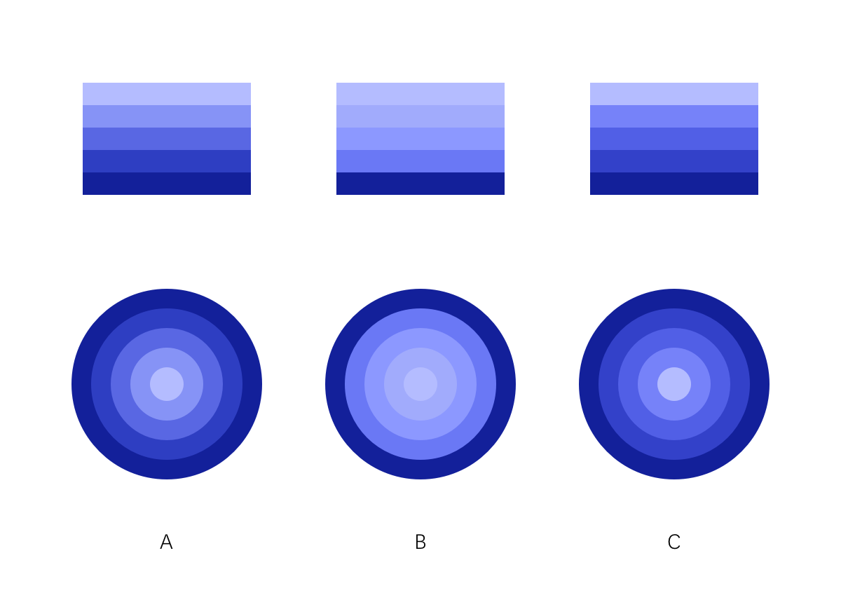
Doing this exercise gives the feeling of shaping the progression and allows the link between intention and result to exist. The mental image I used to help me is that of concentric discs of varying thickness stacked on top of each other, seen from above. The smallest one being the closest to a zenith light source (therefore the lightest), and the largest the farthest away (therefore the darkest).

We can build a linear progression (A), or decide to group the variants in light tones (B), or in dark tones (C).
By increasing the number of variants, it is possible to refine the profile of this fictitious volume, and to ensure a choice of references in the areas of the spectrum that will be relevant to the project. For example, one can produce few light variants that will be used for backgrounds, and produce more dark values for text elements (D). One can also decide to have very subtle variations in the light values for backgrounds, then a few saturated mid-range variants for interactive elements, followed by other dark variants for text (E), without these three groups being linked together by a linear progression.

The graphs showing the progression of hue/saturation/brightness values are only there to show that it would be very complicated to translate them into mathematical equations in order to achieve the result obtained by eye and by hand.
On the question of how many values to produce, it really doesn't matter if you produce a few more than you need. The last palette I produced had between 10 and 12 variants for each of the main tints, but the bulk of the usage was on 4 or 5 variants for each of these tints. This large number had my fellow developers a little worried at first, but 3 years and 6 products later, experience shows that it was never a problem for them. Of course, the number of variants to produce depends on the uses of these colors. It's comfortable to have a wide choice of grays that will be used for text, but error, alert or confirmation colors can be satisfied with three variants.
It is a very empirical method, but it has served me well so far. I encourage you to download this SVG sample file and tweak it to shape variations of your own. Your comments and suggestions are of course welcome, as they could make it better.