Le Baby - interface
version française disponibleObservations, failures and changes of mind: this article details the design process of Le Baby, an essential app for parents with newborns which Amadour Griffais and I have been building and growing for a few years now.

The article will explain how observations of the parents context led to many layout decisions, and how animated transitions between screens contribute the app's ease of use. Without too much jargon, it should be accessible to anyone curious about why and how objects take the shape they have. Having learned a lot from this type of articles, I hope to return the favour here, and participate in this body of collective improvement. A previous article described our perspective on this independent iOS app project, and others will follow in the coming months (App Store publication, tools, communication). On the agenda for today:
- Users context
- Add and review
- Considering lack of sleep
- Using just one hand
- This app is on call 24/7
- Visual continuity
- Aesthetic functions
- What happens to all this data
Let's start with the context
This couple has been sleeping in 2 or 3 hour naps at best for the past 11 days. Their usually well kept living space shows something more important has taken over. It's overflowing everywhere: laundry, dishes, diapers; emotions too. Dressing properly has been declared dispensable, meals are reduced to a necessary calories intake. Their baby is doing wonderfully well, and since her birth she has provided them with this unique spectacle from which they cannot tear themselves away: life blooming. They are enchanted, bewildered, and completely drained.
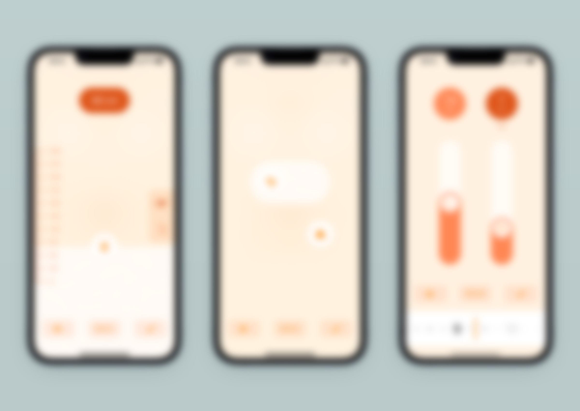
If you've ever welcomed a newborn into your home, this should sound familiar. If not, there is no reason to change your mind. This is the typical context of use for Le Baby. The app's purpose is to allow new parents who wish/need to do so to record their baby's feeding, sleeping and growth events, so they can review them later if in doubt, out of curiosity, or when visiting the paediatrician (if this seems suspicious or even futile to you, this article explains why this is useful). For example, here is how to record a diaper change that took place 15 minutes ago, and a 120 ml bottle feeding that the baby just had:
This quick presentation shows that Le Baby was not built using native iOS components. Each section of this article explains why, in an sequence that does not reflect the process chronology: all context considerations did not precede all the ergonomic choices, the aesthetics did not wait for the ergonomics to be finalised before being explored. Everything was woven together in parallel, each proposal being evaluated from different angles and as a suitable solution to a succinct brief.
If you have an iOS device at hand, I encourage you to install Le Baby (for free) so you can experience what will be discussed. The following screen captures do their best to illustrate the different topics, but nothing beats observing the real product. The version of the app at the publication of this article is 3.4.1, and you can read in the version history what has changed since then.
Add and review

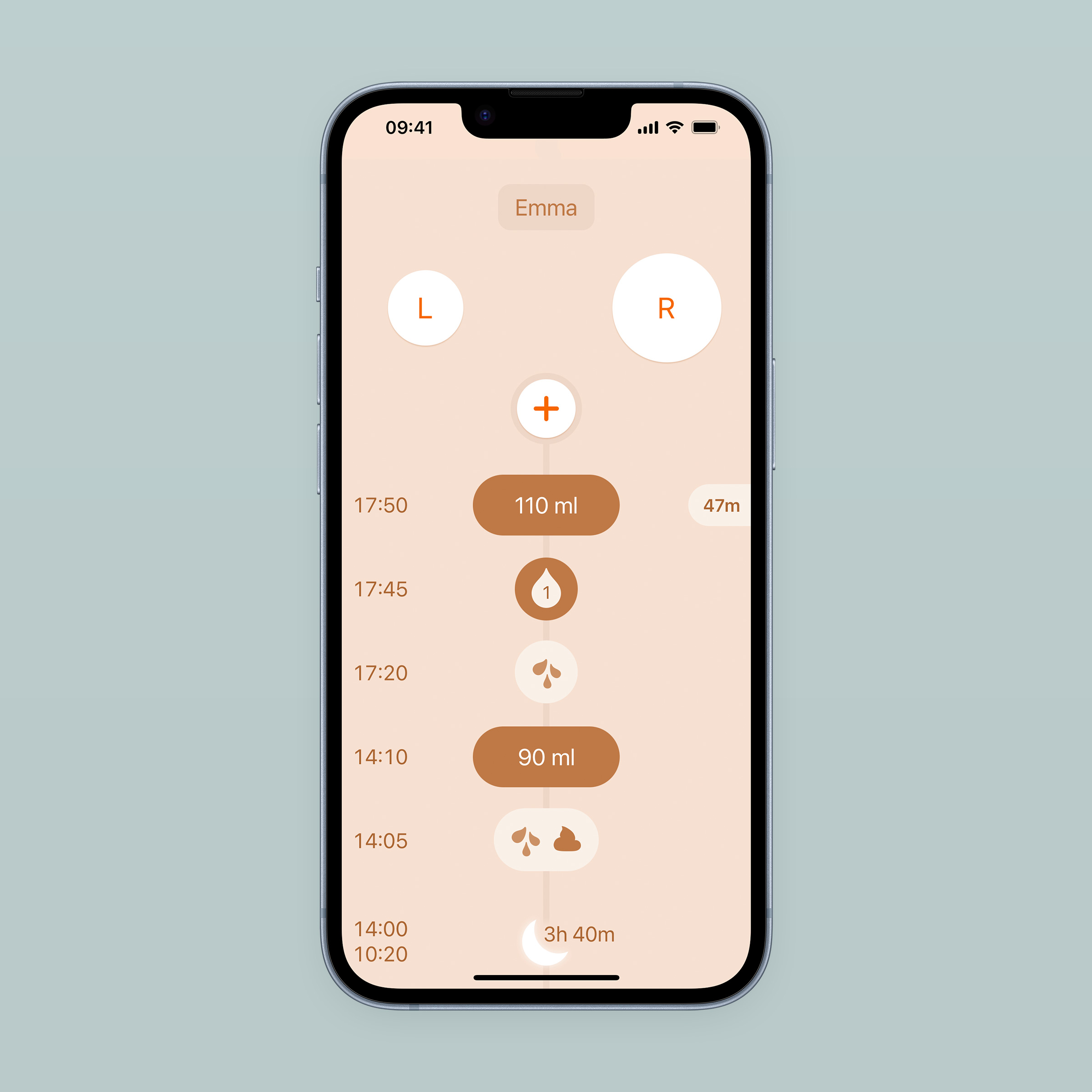
As mentioned above, Le Baby is essentially a memory helper. It's a tool to record information, and doesn't display other content such as parenting advices. Each time you open the app, you should be able to quickly add new informations you want/need to remember, or to review what you added in the previous hours/days. You open the app to note the diaper you just changed; later, to see how much time has passed since the last bottle feeding your baby had. There is no prevalence of one of these tasks over the other, and you should be able to do both at app launch, without having to navigate. This is why the home screen has been divided vertically into two areas: collecting informations at the top, and reviewing it at the bottom.

Collecting informations
There are two ways to add information: using one of the two shortcut buttons at the top, or the (+) button which presents the menu of all available types of entries. A preference in the journal settings changes the role of the header buttons:
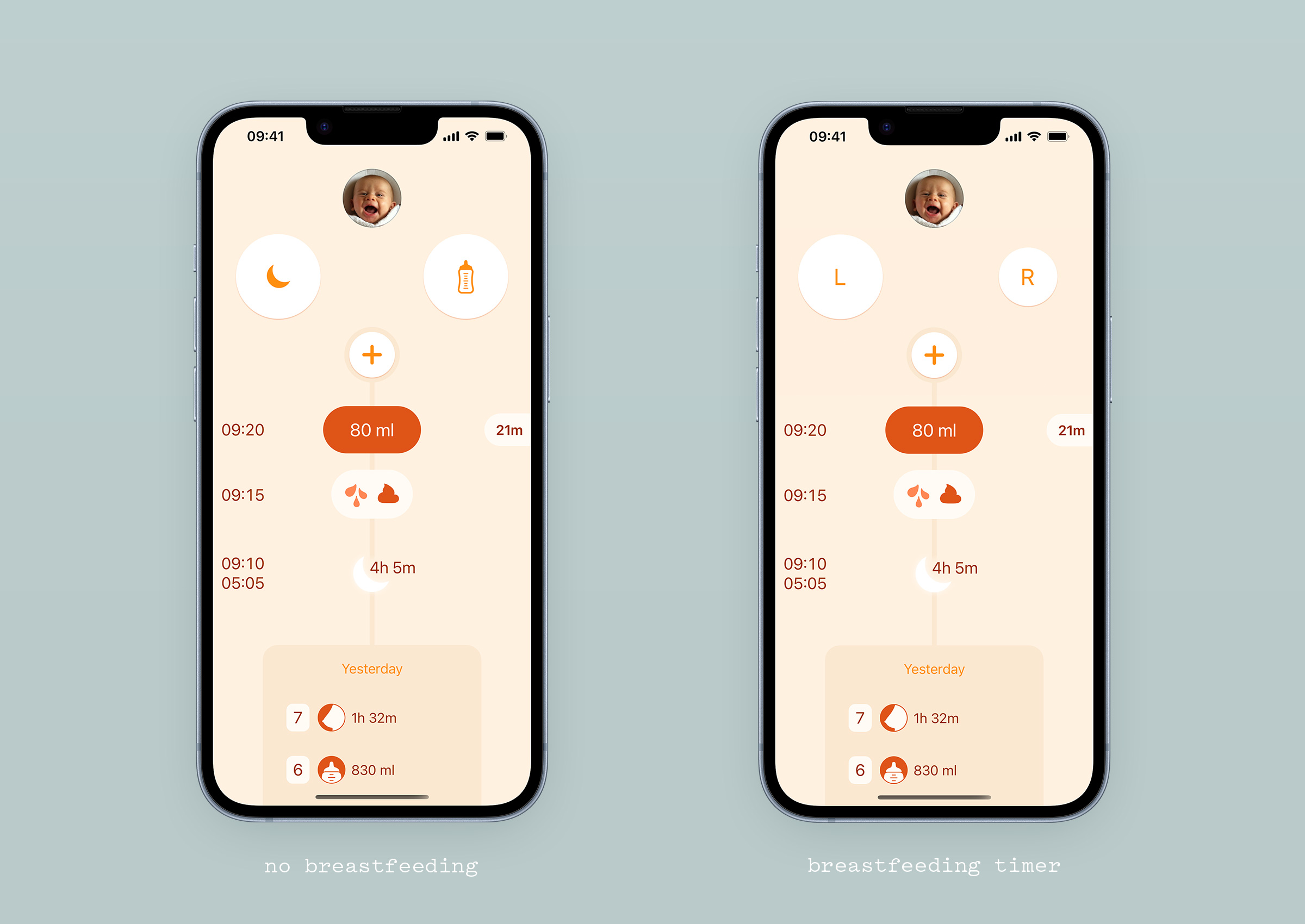
When breastfeeding is switched on, these two buttons become a timer to monitor time spent at each breast by the baby. This helps parents make sure that their baby is having enough to eat when they're unsure, or to get a picture of their baby's current breastfeeding pattern. The timer is at hand as soon as the app is launched, indicating by button size which breast should be given at the next feeding (it is important to alternate from one session to the next). Its functioning is detailed below.
When breastfeeding is switched off, these two buttons are shortcuts to the sleep and bottle feeding entries. Eventually, we'll make it possible to customise the input type of each button.
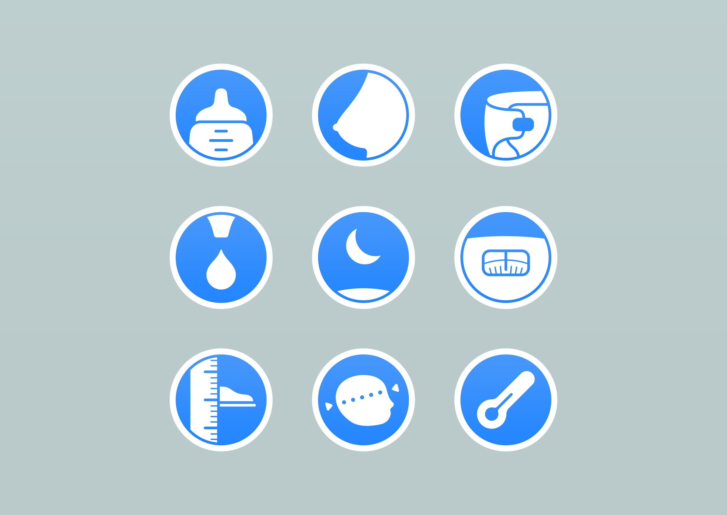
The (+) button gives access to all available input types:

Their arrangement is defined by their usage frequency: the first page has the most used entries, and the second the occasional ones. Frequency has also informed the vertical placement in the first screen, so that the thumb can naturally fall on the most frequent entry types at the bottom. In the v1.0 beta, Le Baby’s menu had a circular layout and no button labels. I made it circular because it animated well when opening from the (+) button, and didn’t add labels as they seemed redundant. An email exchange with a design evangelist at Apple later, I was a better designer who now knew about the inefficiency of such layout, and the benefit of organising icons for usage frequency, and the necessity of adding labels to icons in this context. He made a lot of other very relevant comments, much of them ending up in the product we have today. Quick advice: if you get the opportunity to have a discussion about your product with a design evangelist at Apple, make every arrangement you can to have it.

To further reduce the number of taps needed to add a new entry, some entries default values are based on the last recorded one, rather than on an arbitrary fixed one. This is very useful for bottles that often have the same volume for a few days in a row: declaring the value each time can be repetitive and feel dumb.
It's really fast, 2 seconds, because the layout allows for the thumb to stay in the same position (bottom right corner of the screen) to select the bottle entry and to save it. Knowing it's so easy to enter a bottle makes you more inclined to do it right away rather than postpone it, with the involved risk of forgetting about it.
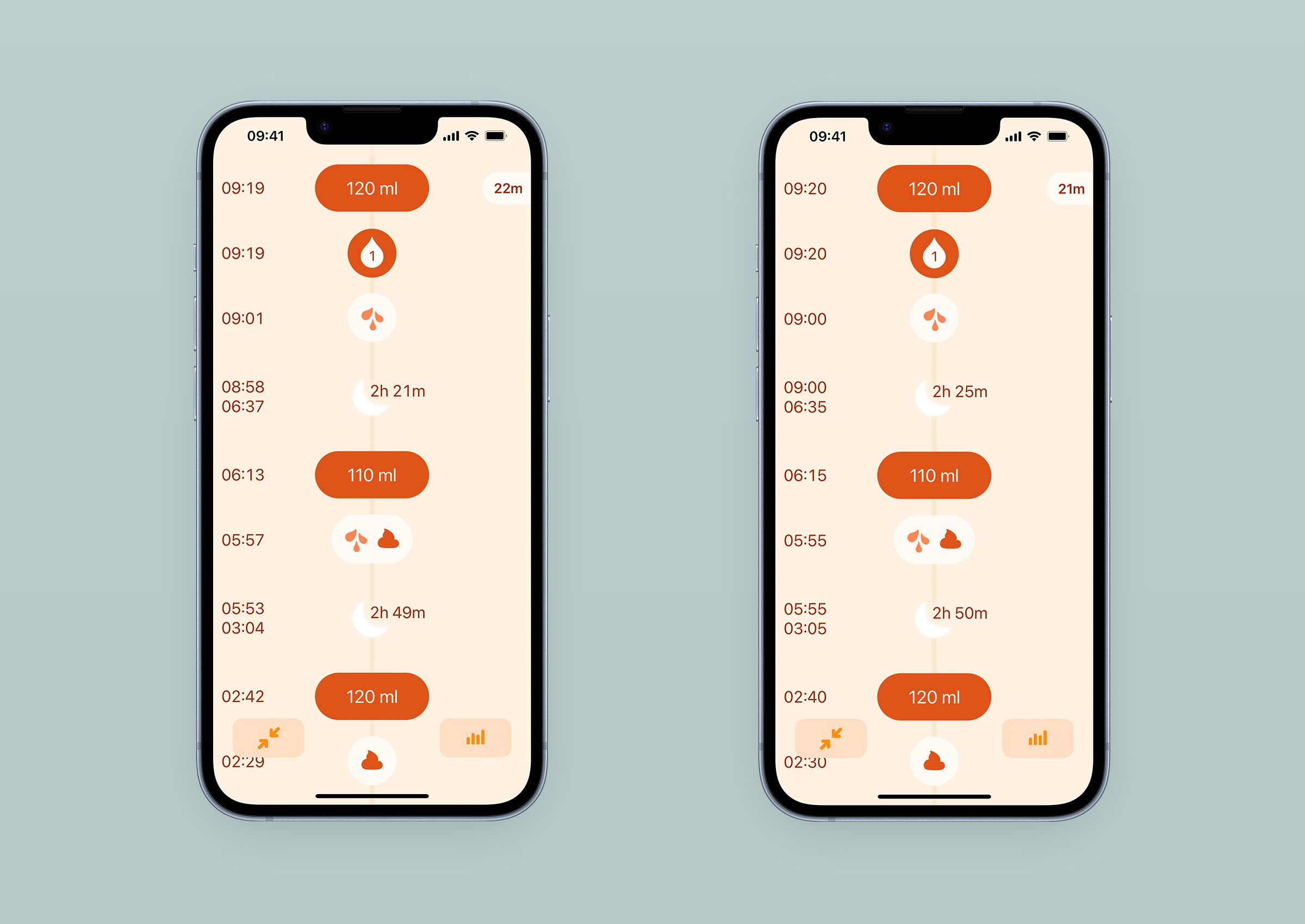
Displaying records
The main screen’s bottom part lists the last entries, answering the question “what happened in the last few hours”, often initiated by the “why is my baby crying” question. The thread of time is represented vertically, the present being the (+) button, progressing down to the very bottom with a birth card. The number of entries visible at a glance when launching the app depends on device’s height: 4 for 4.7 inches screens, to 7 for 6.5 inches screens.
From this initial state, a slight flick upwards will hide the “add entries” top part of the screen to only show entries, with the most recent snapping to the very top. It makes it easy to switch to a review only mode when this is what the user is launching the app for.
Amadour had suggested this behaviour, which initially surprised and disturbed me; you may have this reaction as well when trying it. It’s similar to the one you have when a web page doesn’t scroll the way you would expect it to - Apple’s current product presentation pages are a perfect example of this behaviour highjack. It’s less annoying once you have learned to anticipate it, which happens quickly with multiple daily use. An added value - in our case the benefit of having three more entries to review at a glance - makes this initial negative perception disappear even more rapidly. This situation is a very good example of why one should always question the eventual discomfort they feel in front of a new proposal, and try to track down the origin of this friction. This is a difficult habit to develop, because it is in complete opposition to our quest for efficiency, which makes us apply simple and effective rules acquired through experience to a situation. But I think it’s critical for anyone working on new objects to be aware of their feelings, to be able to describe them, and identify their source(s). And be ready to change their mind.
Back to our entries: when a day ends, a daily summary card displays the sum of the recorded values. At the end of a week, the seven days collapse in a weekly summary card and shows the entries average values for that week. It is of course possible to expand a week card in daily summaries, and daily cards in detailed entries (and vice versa).

Considering lack of sleep

Anyone who’s been a parent will very well know that loss of sleep quality has very concrete consequences: concentration and reasoning skills are affected, while parents have a lot to do, and a lot to learn. Can we say that we shouldn’t expect too much from them? Absolutely. To be effective, the app has to express succinctly and clearly what it has to say, and must not be too demanding in terms of focus required to be handled.
Way finding and frequent usage
Between the screen size of a smartphone and the almost constant fatigue of users, offering a great experience isn’t an easy task: we have to be very explicit while optimising the readability of the informations the user is looking for by using a generous font size and large safe zones around elements.
Labelling every entry in order to be explicit implies a counter-productive repetition (90ml bottle, 110ml bottle, mixed diaper, 2h20 sleep, wet diaper, 110ml bottle, 70ml bottle,…).
To avoid the presence of abundant, repetitive and therefore not very useful signs for an app used several times a day(1), Le Baby uses a distinct shape for each elements on the screen. A bottle entry does not look the same as a weight entry. The menu access button has not the same shape as the journal settings access button.

Simplifying the look of the product to optimise its daily and repetitive use seemed more important to us than making it absolutely explicit upon discovery.
By asking users an effort to get familiar with the app, we were able to make it visually much simpler than other competing applications showing the same content. This visual lightness has a very positive impact on readability, but also on the product’s emotional perception. Comments left by users on the App Store(2) often highlight simplicity as a big plus of the app. They also regularly use the term “intuitive”. These notions are very valuable at a time when many things seem, and sometimes are, complicated.
That being said, making people who try Le Baby quickly realise they have a very practical app in their hands is critical. They’re most likely tired and have a lot on their hands already. To bridge initial perceptions with daily efficiency, a short and asynchronous getting started guide is displayed just below the (+) button when the app is first launched. It lets the user progress at her own pace, be interrupted (by a baby demanding attention, for example), and allow her to use the parts of the app that are already well understood. Guides taking over the whole interface and needing completion to be closed are clearly not appropriate in this context.
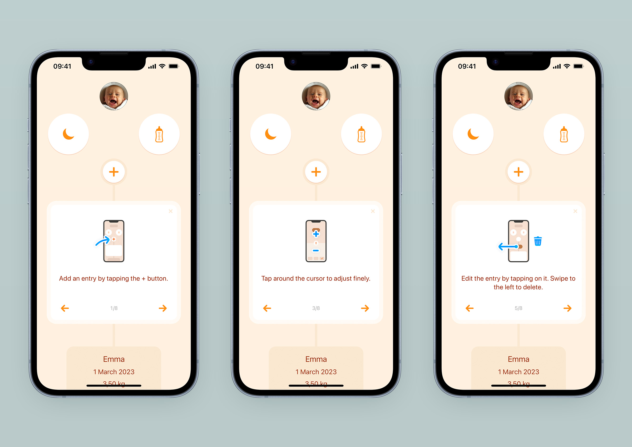
The first version of the app had no guide, only a help link that took users to our website. Visits to this page were frequent enough that we did some user testing with young parents, and realised we needed to do better. In our quest for minimalism - as a matter of principle, but also as an effort to reduce translation costs - we first animated the menu access button, an animation that is still present today. It moves as if it was waving the hand to say “come here, this way please”. At the time, it seemed enough of a hint to put parents on track to their first entries. Wrong! Subsequent user testing showed us that we were too optimistic, probably also too proud of a supposedly smart solution to our problem. It was very painful to watch these people standing idly in front of this screen which seemed obvious to us, but which to them was unusual, empty, clueless, despite this little central (+) button swaying in front of them. A person who is tired and/or in a hurry does not have the leisure to put in the effort of a conceptual interpretation, however clever it may be, and a clear indication with well-dimensioned set of words remains way more effective. That’s how the guide came to be in the app, and we asked translators to adapt it to the nine languages we offer.
The guide was initially text only, with 17 steps. We have reduced them to 8 and added illustrations to make it more pleasant to browse. If needed, it can be displayed again from the journal settings.
Screen structure
Another decision increased the feeling of simplicity: giving the same structure to all input screens. Top to bottom are the value to record, a large area to control the value, and buttons to access time edition, cancellation and validation of the new entry. As these screens are manipulated very regularly, the consistent structure helps building up muscle memory, which increases comfort of use over time.

As much as layout consistency helps users, it is also crucial to make input screens as visually distinct from each other as possible. Selecting the wrong item in the menu can happen, especially with lack of sleep. We’re helping users realise they’ve taken the wrong path quicker by not requiring them to read labels to do so. Each type of entry input has a distinctive visual design related to its nature, serving as an immediate navigation feedback, while also participating in building the app’s personality. And again, the visual expression is as simple as possible, without too much detail to preserve the perceived lightness.
Rounded values
In the same vein of smoothing the interface and reducing visual noise, the recorded values are rounded within an reasonable range for tracking quality.
When editing the time of the entry, the default granularity offered is 5 minutes. Because it’s easier to parse a list of times set with 5 minutes increments than the same list set with regular 1 minute steps.
For breastfeeding and sleeping timers, seconds are discarded as they have close to zero value in monitoring a baby’s habits. In the breastfeeding timer, however, the seconds spent at each breast are displayed: their ticking is a visual confirmation of active recording, and they can add up significantly when the baby switches from one breast to another and back during the same session.
For bottle feedings, the volume is rounded to 10ml (0.2 fl oz) by default, as this is what bottle graduations display most of the time. However, it is possible to adjust it with 1 millilitre (0.1 fl oz) steps by tapping above or below the cursor (especially important for premature babies). An interaction that is not obvious to discover, and which we plan to improve (roadmap management will be discussed in a future article about the tools and methods used in this project).
Generously sized buttons
Beside the alarm clock and the Phone app, there aren’t many interfaces that are supposed to be successfully used right after an unsolicited wake-up call in the middle of the night, with users not as sharp as they can be. A breastfeeding timer like Le Baby’s is another one. To increase the chances of success of adding information in these muscular coordination challenged moments, the size of the buttons has been increased as much as possible, balancing three constraints: respect for the semantic hierarchy on the screen, adaptation to small devices (4 inches), and aesthetic harmony.

This is particularly true of the shortcut buttons, the breastfeeding timer, the menu buttons, and sliders. This principle of enlarging the active area as much as possible has been emphasised even more in the bottle, temperature and measurement entry screens, where the whole central area is interactive. No matter where the finger lands around the cursor, it will work.
Using just one hand

This subject regularly leads to a misunderstanding that I would like to clarify right away: no, the idea is not to get parents the use Le Baby at the expense of their baby’s care. It’s easy to imagine a parent walking around staring at their screen, while their newborn gently slides off their shoulder without them noticing.
Those who have been parents not too long ago know it well, and the hormones of those for whom it’s been a while have erased this memory so that the human species can perpetuate itself: a baby requires constant attention, almost permanent physical contact. The practical consequence is that a parent does not often have both hands free, one of them being busy with reassuring the baby. When designing an object that is used with fingers, this is a situation worth considering.
We made it one of the fundamentals of Le Baby: a person with small hands and a large device had to be able to use the main functionalities of the app with one thumb, whether it was their preferred hand or the other. The placement of the interactions on the screen and the size of the active areas reflect this goal.
Navigation happens at the bottom
A few years before Safari’s address bar and tabs were moved to the bottom of the screen, in a flurry of outraged tweets, Le Baby’s navigation actions had taken up residence there.
When adding an entry, three buttons are under the thumb: cancel the entry, access time change, validate the entry.

In the main screen, when displaying the full height journal, two buttons appear at the bottom: the one on the right gets you to the charts (more below), and the one on the left allows a return to the initial state of the home screen without having to reach for the status bar (the first few millimetres at the top of the screen containing the time, battery level and network quality). When expanded daily or weekly summaries are in view, this left button adjusts its icon and role: tapping it will fold the day and week elements into cards. Once all entries are collapsed, or when the expanded summaries are no more in view, the button reverts to its original function of navigating the journal to the present.
If you want to see for yourself how these summaries behave, you can import this journal sample containing several weeks of data into the app(3).
Improving time edits
Before explaining why we decided to go with a custom solution, I’d like to express my appreciation of the native iOS component for selecting dates and times: those scrolling wheels, which have been part of the system since v1.0. Despite their lack of affection, from what I gathered, they are in my opinion one of the most successful iOS interfaces. They offer the possibility of setting date and time in all existing international formats in the footprint of a half business card, available for any application that needs it. Fifteen years later they are still there, regularly updated but with the same underlying functionality and modularity allowing them to adapt to multiple situations. They are an excellent example of compromise: accepting some shortcomings in terms of handling (you sometimes need a few swipes and taps before getting to the desired value) to ensure a functional coverage that can reasonably be described as vast. Congratulations to you, wheels, and to the team who made you.
Users have to edit time several times a day, sometimes in the middle of the night: these wheels, as brilliant as they are at the system level, didn’t seem well suited for the situation. They require some amount of gestural precision, whereas the most frequent use is an adjustment of a few minutes, more rarely of a few hours.
Our solution had to offer the most generous active zone possible so that time modification could be initiated without much finger precision. It was also necessary to reach the desired time with the least amount of gestures and muscle control. A large horizontal timeline revealed when needed allowed this. Its scale was calibrated so that one could go back about two hours by moving the thumb across the width of the screen. Its celerity has been finely adjusted by Amadour so that it is possible to move quickly in time by flicking left and right.
Initially, we did not give the possibility to pick a date in the past using a calendar view. This is not the nominal use case, and we had more pressing features to implement. To add an entry several days in the past, users had to flick right as many times as necessary. Amadour made it so that the speed of time traveling increased with the number of these swipes, and moving several days was doable, occasionally. We received an email from a user who told us how cumbersome it was for him to add the entries he made in another app before switching to Le Baby. Learning from someone considering switching was fantastic news, but realising how the app was preventing this to happen more often was a downer. The calendar picker suddenly bubbled up the roadmap. The date displayed in the middle of the timeline to display the current day became a link to access a native date picker. Much more comfortable, and it will be useful for parents who will want to catch up on the growth entries we just added (height and head circumference).
Menu access
You might have already noticed that the (+) button location on the screen is in full contradiction to the need for essential buttons to at easy reach. It’s impossible for the thumb of a normal-sized hand holding the phone to extend and touch this button. Fortunately, pulling the journal down from anywhere on the screen will display the entries menu.
Here again, the behaviour is different from what is now widely expected when pulling down and releasing a list of chronologically ordered items. Repetition and the added benefit of an effortless access to all the entries makes this behaviour seem “normal” after a few practices. Just as Safari’s URL bar doesn’t seem to be a problem for anyone, in the end.
This app is on call 24/7

Making the app ready to use just after being woken up has already been mentioned above, so you have probably already understood it, if not experienced it yourself: for several weeks, a baby can sound the siren at any moment. Sleep is just one of the many activities a baby can interrupt: taking a shower, preparing a meal, talking on the phone, or fixing a bike tire. What I try to convey here is that we’re not always prepared when Her Highness summons us. In some of these situations, it can affect how the app is used: you sometimes don’t have the possibility to turn on the light when you’re in the dark, or to put on the glasses you need to read.
No glasses
I’ve had to wear prescription glasses since I was a child, so this topic was an easy one for me to consider, and test for. For those who are not familiar with it, not having your glasses on means a general blur sets in; fine lines disappear, letters of texts that are too small become impossible to distinguish from each other, and details of shapes drown in a approximate mass. Without your glasses, most apps become unusable, but there are ways to mitigate that.
Two of the app’s tasks can be more urgent than grabbing your glasses from where you took them off: checking the latest diary entries to get clues about these sudden alarming cries, and for breastfeeding mothers starting the timer after identifying the breast to feed the baby with (it’s important to alternate).

On top of the main screen, the next breast to be given is indicated using size. The difference between the two sides is still perceptible despite a strong level of blur. The timer remains fully functional despite this degraded visual experience: the two breasts are identified by their left or right location on the screen, the one that is being recorded is placed in the center, and the pause state is recognisable by the validation button appearing below.

Two design decisions are helping users not wearing their glasses to interpret the latest journal entries: differentiating types of entries using shapes, and singling out feeding entries from the others by using a more contrasted background. This way, it’s possible to obtain a first level of information without even having read the recorded value or the precise time of the recording: a bottle has been given, after a full diaper has been changed. It would have also been effective to use a different color for each type of entry, but it would have been much harder to produce multiple color themes for the app, which serve a pretty intense use case (see below).
When designing the menu icons, I made sure that the dense area of solid color was placed differently in the circle from one icon to another. This makes them distinguishable from each other even with a blurred vision.

A person who has never seen them will not be able to understand them by seeing them like this, and that’s ok. The goal is more that a person who is somewhat used to them is able to distinguish them from memory and pick the one she needs. And if the user happens to go with the wrong one, the distinctive composition of each input screen will tell her quickly it’s not where she wanted to get to.
As I hinted to earlier, Le Baby comes with different color themes to choose from (detailed below), and one of them has been designed to provide the highest contrast, making it more suitable for those of us who are not lucky enough to have perfect vision.

In the dark
From version 1.0 we proposed a Night Mode, which role is to limit the amount of light emitted by the screen when the app is used in a dark setting. First benefit: the user doesn’t get dazzled after his eyes have adapted to darkness. Second, the other parent who might be sleeping in the same room is less likely to be woken up (if sound levels have not already done the damage). And third, the baby doesn’t get distracted when feeding by the light shining upwards on his parent’s face (there’s potential for life long trauma here, now that I think of it) and the ceiling.
How does this work? iOS constantly adjusts the screen brightness based on the ambient light the device senses. We piggyback on this feature to trigger the switch to Night mode when the screen brightness drops below an empirically defined threshold.
Initially, the app offered 6 color themes, and one night theme. The introduction of Dark Mode with iOS 13, one year after the release of our v1.0, could have led us to drop the Night Mode, and offer a darker interface as a Dark Mode variation for each theme. But uses are not quite the same. Dark Mode can be activated automatically in the late hours of the day, but also all day long for aesthetic preferences: for these situations, it was necessary to guarantee the readability of the interface in a bright context when in Dark Mode. This required the use of contrasts that increased light emission overall, which does not fulfil the promise of our Night Mode. The solution was more work, and providing for each theme a Night Mode, a Dark Mode and a Light Mode variation.

While we were at it, I took the opportunity to further reduce the amount of light emitted by the Night Mode. This is one of the aspects of the app that I really encourage you to try for yourself by manipulating the screen brightness in a pitch dark room, as the representations made here can’t reflect its real life effectiveness. Compare how much light is emitted from the screen in Dark Mode in Mail or Notes to Le Baby with Night Mode.
Visual continuity

Navigating from one screen to the other happens with animated visual transitions. They make of Le Baby a coherent, responsive and organic whole, with screens seemingly articulated with each others. As the journey through the app is visually continuous, it’s easier for users to build a mental image of its landscape, which increases their comfort of use. These transitions play the role that a binding can have for a printed document: it makes a series of loose sheets into a finished, ordered and articulated object.
If you don't have the possibility to try the app for yourself, here is a 2 minutes walkthrough video (with sound) that will give you a better feel of how the different screens relate to each other through these transitions:
In interior design, to subtly convey that two distinct spaces are part of the same whole, one or more similar attributes are applied to them; this can be a ceiling height, wall or floor material, a color palette, the nature and/or arrangement of accessories, a lighting quality, a sound ambiance,… By passing from one space to another, even through a closed door, we understand that two spaces that were unknown to us are linked. Without these similarities, we would interpret this crossing as a frontier, like that of the hall of a building to a store.
The graphic style guide of an app is a tool that, beyond its role for visual identity, brings together a series of screens in a coherent whole. As important as it is, it remains a static method inherited from printing that does not take advantage of the time dimension of digital interfaces to produce meaning. The behaviour that can be given to certain elements such as buttons or content blocks uses this third dimension to express unity: buttons can have the same way to bounce when tapped, content can be appearing in a certain way. But this expression is limited to the contours of a single screen, and moving from one space to another often offers the same visual experience as switching from one TV channel to the next with a remote. Sure, it’s responsive and immediate, but a little terse.
At the system level, iOS performs an animated transition between an application’s icon and its interface at launch, and vice versa when you close it. This helps to better perceive where you are coming from, and where you are going next. At the app level, Photos does the same when you switch from film roll to a shot. Navigating the Settings and Mail apps uses transitions of opacity, position and scale operated between the start and destination screens. But this is still a very light approach compared to the continuity cues we pay attention to when browsing physical spaces. There is a reason for this: it is much more difficult to implement than fitting a carpet on the floor or hanging a fixture on the wall.
Working with Amadour Griffais was instrumental in making screens transitions a reality in Le Baby. It takes more than technical ability to apply them through the whole app. You also need a good dose of patience, method, and above all a real sensitivity to this subject. You have to be convinced of the importance of these transitions in the experience of an app in order to mobilise your know-how and to spend your time working on them. For my part, beyond having the desire to see these screens evolve in this way, I only spent some time in Keynote to sketch them with Magic Move transitions. In retrospect, it’s almost certain that these ideas would have remained mock-ups and Le Baby would never have seen the light of day if I hadn’t crossed paths with Amadour in my career.

It’s a fact that few designers talk about, at least in what I read: without an engineer capable of building what is sketched, of setting up the technical conditions so that it can be executed, the mockups we work on are just letters to Santa Claus, however polished they may be. Without clean, structured data, it’s impossible to present the right information at the right moment, or to address the user in a relevant way. Without a developer who is sensitive to the appearance and behaviour of an interface, and who has a minimum of graphic culture, it is complicated - and costly in terms of time and nerves - to move forward with a project at the speed required by user expectations. Without time for the developer with these sensibilities to deal with these aspects, it is not possible to implement them properly.
Here are some examples of these slow-motion transitions. Nothing very complicated visually speaking, but the iOS developers among you will probably have a different opinion (everything is in Objective-C).
Beyond the meaning and comfort they bring to the app, these transitions make the kinematics of how the entries land in the journal really pleasing. When a new entry is saved, the value element on top of the screen hovers into the journal which fades in, and where room has been made for it. There is no traveling back from an input modal to a list enriched with an item that has appeared on the sly, as is usually the case (in the iOS Calendar app for example). There is a progression towards the journal where we witness the value of the new entry being added. During the first minutes of use, this mechanic informs the ante-chronological organisation of the journal.
Another example where visual continuity is put to use: the breastfeeding timer. For those who are not familiar with the topic, breastfeeding mothers need to remember which breast the baby spent the most time on at the last feeding - it is important to alternate to keep the milk supply going. They also may want to keep track of the total time spent nursing to ensure that the baby is getting enough to eat.
The transitions are enhancing the visual feedback telling which side is being recorded by moving it to the center of the screen. Just as the baby moves from one breast to another, the timer shifts its buttons position as it operates.
Aesthetic functions

Up to now, explanations about how Le Baby’s interface design process were about objective and tangible topics. But its perception and use are also informed by its aesthetic attributes, and the emotions they initiate.
To have on one side the “logical” choices and on the other the “emotional” ones, or even to give more importance to one than to the other, does not make sense since both influence each other when we experience a product, whether we want it or not. It’s important to consider both at the same time when building a new product. I’ll let you extrapolate on what I can think of the distinction that has been imposed on us for years between two so-called distinct design practices that start with a U and end with an X or an I.
Visual attributes of an interface trigger emotions, sometimes subtle, which make users associate the product with a cultural universe or a passed experience they had. This happens whether designers anticipate it or not. I’m not saying they’re able to prescribe the entirety of what users will feel when using a product, this is nonsense. But by making deliberate and informed formal choices, it is possible to anticipate associations with cultural universes, to prevent association with those to avoid. All the specifications detailed so far for Le Baby could be shaped in a nineties, cyberpunk or baroque app. With more nuance, it would be possible to give a traditional, childish, medical, technical, or kawaii character to this practical baby tracking application. But it’s not what was done. The intentions for Le Baby were to express softness, simplicity and harmony.
Softness
In babies land, roughness doesn’t sell. Anything that touches a baby has to be soft, and it would be risky for this app to avoid this rule. Parents face enough friction on a daily basis to be spared of them when possible. So it was important that the app expresses as much calm and serenity as possible, for parents to get a little glimpse of it from time to time.
In the interface, softness is expressed with the choice of pastel colors, with the icons organic shapes, with the animations settings, and by the visual treatment of graphs.

Simplicity
This is one of the guidelines of the project, and the functional promise of the app; it seemed appropriate to reflect it visually.
The scarcity of elements on the screen is already doing a lot of work to convey the idea of simplicity. It’s reinforced by using geometric lines in the functional objects of the app: buttons, containers, cursors and administrative icons (cancel, ok,…) are drawn using circles and rounded rectangles, with as few interruptions and sharp corners as possible.
The font used in an app has a major influence on the emotional perception of it. When the project started in 2014, I had selected Avenir as the font for the interface. Its clear, modern and generous design corresponded well to what I wanted to convey. And being one of the fonts installed by default in iOS, with six variants, it allowed a nice leeway in graphic expression, without the weight of the app having to suffer for it.

When we resumed working on the project in 2018, San Francisco had replaced Helvetica Neue as the default iOS font. At the time, it was the only native font that offered the ability to inexpensively adjust an app’s text size based on system settings. It was close enough to Avenir in terms of aesthetics that we gladly went with it. Neither of these two fonts are in my opinion the ideal one for Le Baby, but they’re the closest. Font choice is an area of interface design demonstrating that we really have a relative control over the incarnation of an aesthetic intent. Knowing how to compromise is, again, key to move forward and build.
Harmony
As already mentioned, young parents’ daily life is upside down in the first few weeks. Le Baby helps them get a clearer picture of the day’s course, by presenting an orderly reflection of what has happened. Events are explicit, distinct from each other, and stated in their chronology.
This space of reference where balance and harmony are sought for would be less convincing if these notions were not visually perceptible. The axially symmetrical composition of most of the screens helps to evoke this feeling. As for the colors, only two tints are used in the screens: the main one for almost all the colors, and another for the accent. Using this limited palette, which is largely pastel, helps to make Le Baby a calm and balanced space.
Appropriation
I’ll add one last point before concluding this part dedicated to visual choices. Very early in the project we offered users the possibility to choose the color theme of the app. A choice (limited, of course) that let the users express their personal preference when setting their baby’s profile. The theme presented by default when installing the app has this color that is often called “nude”, as relative this notion can be.
It is a shade often used by services or products related to pregnancy, maternity and early childhood. So it seemed like a good starting point. Personally, I’m not a big fan, which is probably why I thought of offering a few variations.

All screens are composed with nine colors: black, white, main, light, dark, darker, very dark, and accent. An exercise of constraint that with time I ended up regretting because it greatly limits possibilities when I work on new themes. Some references are used in solid colors and for texts, which makes it very complicated to propose themes that are more dynamic and more contrasted than those available today. The number of these references and the elements to which they are associated means that we can’t really do anything other than pastel themes. Lesson learned, I always give new interface projects a large palette of variations to choose from.
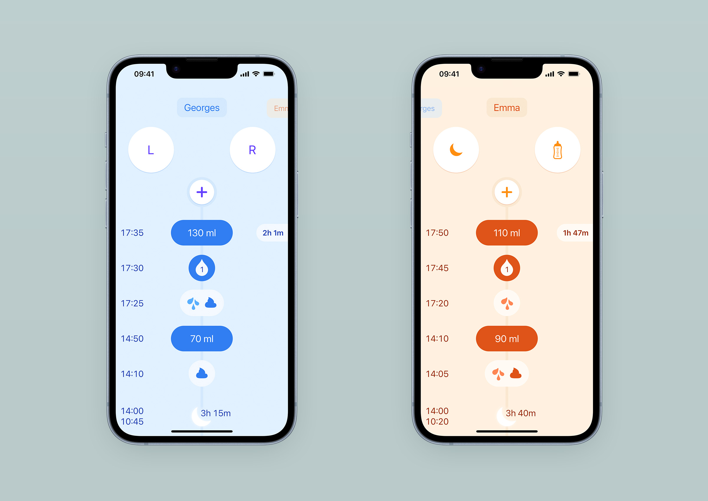
The existence of these themes allows parents of twins and triplets to differentiate them immediately upon launching the app, whether in day, dark or night mode.
What happens to all this data

Le Baby displays the data collected by parents in two places: in the journal and in the graphs. The journal provides an easy way to review what happened in the past hours. The graphs give them a synthetic view over a longer period. The data is stored either on the device, or on iCloud servers. It remains private, even while synchronising between multiple devices.
Privacy

It’s a notion that has no manifestation in the interface, but has an important imprint on the app’s list of features, and influences its use.
Amadour and I have long believed that privacy is as important in digital products as it is in our physical environment. From the beginning, we felt that we should never have access to the informations parents add to their baby’s journal. We wanted Le Baby to be like a paper notebook, where what’s written in it can’t be read by its manufacturer. By default, the data recorded by users is only stored on the user’s device. It will go elsewhere only if the user decides so. There are three ways for records to end up outside the app: a CSV export, the iCloud backup, and sharing the journal with one or more other iCloud accounts.
The reputation of apps today is such that despite the privacy protection arguments we added on the App Store description page and marketing website, we discovered that some users were suspicious of what happened to the informations they added to Le Baby. For example, some did not add their baby’s picture to the baby’s profile. We have not had any feedback regarding the text notes specifically, but it is likely that some users do not use them, or use them less than they could, anticipating that they might be read by us or other third parties. We may need to make it clearer in the app that this is a strictly private space where users have the freedom to add what they want.
Charts
Initially, I didn’t want Le Baby to have graphs, for two main reasons. First, I felt that they de-humanised the relationship between a parent and a baby, and would prevent parents to learn trusting their guts. Plotting a newborn’s habits like a marketing campaign results seemed to defeat the purpose of the app, which is to remind parents of what happened so they can calibrate their feelings and gain confidence in their observations. Second, I was concerned that some people might be tempted to rely on these graphs more than their feelings to make their decisions. Graphs visually imply a norm, an amount to be reached, a minimum and a maximum, whereas each baby has his own rhythm, and it is important for his well-being to respect it.
Amadour was much more enthusiastic about the idea: the information collected is in the app, parents made the effort to record it, why not present it to them in a more accessible way, and thus make it even more useful for parents? Almost all competing apps offered them, and some users emailed us asking for them. Amadour took the matter in his hands, and we had graphs. I made sure access was not at the forefront when launching the app, and that their rendering was the least scientific, accurate and cold as possible. Navigating between the entries and the graphs is a thing of beauty, as both timelines are synchronised. The journal sample will let you play with it if you want to.

Last year, we added the routine graphs that allow parents to view the evolution of their baby’s sleeping and feeding patterns. Little by little, nights are becoming less interrupted, and meals are slowly normalising. Here is an example taken from a real journal that a user who contacted us agreed to share:

There is also a weekly view which is here to provide an overview of a longer period within the width of an iPhone. These views were a bit of a design and data processing challenge, to say the least. First, the color theme constraint imposed the use of shape and transparency to differentiate entry types. Second, representing the average activity during a given hour of the day for an entry type forced us to make choices as to what was negligible and what had meaning. I’m not going to get into the fine details, but let’s say we have tried many recipes before the one currently in production.

These routine graphs make every journal tell a different story. Despite its analytical appearance, it is a representation of an experience that parents will undoubtedly look at with nostalgia in a few years. The risk that these graphs tempt some to feed their baby at a given frequency for a given quantity exists, and remains for me a problem to be solved. But for most parents, they offer a relevant insight into the first few weeks with a baby that is otherwise impossible to get. So in the end, I’m very glad we added them.
Journal sharing
When taking shifts to care for the baby in the early days, being up to date without having to disturb your significant other is really, really, really helpful. This is what journal synchronisation between devices allows. Initially absent from our roadmap, it quickly became a key issue for the future of the app. Our initial omission can be explained very simply: setting up data synchronisation is a major and long technical project. All solutions are a multi-faceted compromise between data protection, reliability, implementation effort, and maintenance effort. Announced in September 2021, iOS 15 brought a lot of new features to CloudKit which allowed us to offer a sync that is simple for users to set up, end-to-end encrypted, and gives us the luxury of not having to manage servers ourselves. The trade-off is that when things get glitchy, we have no way to work on a fix, as we just experienced with iOS 16.3 and it’s what turned ou to be a conflict resolution bug. The implementation was not turnkey though, and took a lot of efforts because documentation is not complete. But when it works, it’s like clockwork.

From an interface design point of view, sharing is quite transparent: only a small icon that sometimes appears on the right of the baby’s name, indicating that it is in progress, or has failed. This is a perfect example of those features where the number of hours of development is inversely proportional to the pixel footprint in the screen. It’s also an opportunity to remember that the design of a product goes well beyond its interface. The benefit for users was quickly and clearly expressed in the comments, especially for parents with twins.
Conclusion
As long as this article ended up being, there’s a lot more to comment on design decisions made for this project. The app is far from finished with many shortcomings still to cover, and this article may have a companion in the future. That said, if you’d like more details on a specific topic, don’t hesitate to get in touch and I will try my best to respond.
User feedback for Le Baby has been overall pretty good. On the App Store, its global rating is at 4.8 stars, and reviews are usually positive. Critics are mostly about what’s missing, rather than about a bad experience with the current features. Having users telling you they found good value in what they’ve been provided with is such a great reward.
Every project comes with lessons to learn from. Before starting Le Baby, I already knew that careful observation of the context can lead to new ideas and good solutions. There are many little practical things that I learned from this project, but here are the two main ones: accessibility can be a temporary issue for a user, and staying focused on a small set of strong initial principles is a good way to achieve meaningful work. I hope this article will have covered new ground for you, and that it was worth your time. The next article about Le Baby that I will publish here will be about its identity, followed by a presentation of the tools I use on this project.
- In the last 30 days, usage statistics we get from App Store Connect indicate 10 to 15 sessions (of at least 2 seconds) per day, averaging at 13.↩
- The vast majority of users are from France for now, despite the app being translated and presented on the App Store, screenshots for 4 screen sizes included, in 9 languages. So most of the reviews Le Baby has are only visible to French AppleID owners.↩
- Once the csv file opened, access the share sheet. It should list Le Baby as a compatible app for the file. Tap the icon, and you should be presented with an import confirmation screen within the app.↩