Interface sketching
version française disponibleDuring a recent project, I put together a tactile interface sketching tool allowing to quickly evaluate layout and behaviour ideas. This post is going through the why and how it came to be, explains how it works, details pros and cons, and ends with a few practical advices.
More and more articles explain to us the primary role of time and kinematics in the production of meaning for tactile interfaces. But as of today, it isn't really easy for a designer to quickly sketch out an interface behaviour for a smartphone or a tablet.
Some existing tools help in this regard by allowing you to link static images one to another using hot spots and animations, recreating a desired experience. For example, taping a menu button on the main screen would slide this screen to the right with a nice ease-out, making room for the menu itself to appear, items fading in one after another.
These tools might provide you with the possibility of manipulating a rough idea of an interface on a device, but they offer a limited choice of behaviours. Only the most “popular” are presented, the same ones developers can implement with little effort when they build an application.
For time and ressources constrained projects, these tools are perfect to get you to a very high fidelity prototype in no time. But if the set of constraints is somehow a bit exotic, and if you would like to experiment new interaction models to answer to them, these tools loose their advantages.
Asking a developer to sit next to a designer to produce interaction sketches which for the most part will be mercilessly discarded - it's their goal in the design process - is a possibility, but it's also a luxury only a small number of companies can afford. For projects where ressources are slim and budgets tight, this comfort is not affordable. Does it make it acceptable to our colleagues that we carry on with explaining our ideas through paper sketches associated with elaborate gestures and sound effects? Probably not.
Origami (graciously shared by one of these almost infinite budget companies, many thanks) seemed very promising to this regard when it appeared. But also very intimidating. The learning curve getting you from total novice to confident in Quartz Composer is a bit steep, and this learning time isn't always justifiable to produce soon to be discarded sketches.Another pitfall found in Origami is the mouse driven nature of the interactions. To properly evaluate a tactile interface, you should manipulate it directly so you can discover when active zones are too small or too close, or when the hand hides useful informations to complete a task - small but important details that could go un-noticed using a mouse cursor. On the other hand, this tool seems ideal for fine-tuning an animation and transmit its attributes to developers. But if the quality of an animation is crucial to get an interface right, this is not our concern here: we're talking sketching, not finish.
While I was looking for a solution to economically produce interface sketches, Keynote for iOS was a good candidate. Documents can be edited on the OSX version and transferred to an iPhone or an iPad. Direct manipulation is a big win, but where it's deceiving is that you can't actually manipulate the prototype anyway you want. Forget pinches, list scrolls or carousel swipes: any touch on the screen and you're off to the next slide.
But Keynote brought a very consistent advantage on the table: no effort in the production of a transition between two screens. Whatever the shapes, their colors, orientations... as long as the objects are present in the starting and ending slides, the transition is fluid and relatively predictable. It's the well named “Magic Move” transition. I could not let go the time savings this feature allowed so I made concessions on two fronts: holding the interface in my hands, and the relative spotlessness of my screen. The speed I could produce work and the kind of deliverables I could produced were great compensations to these losses.

It took me about an hour and a half to get from a new document to the prototype shown on the video above, made of 14 slides. Keynote can export a video from the slideshow so you can share your ideas with your colleagues, adding notes using the timecode for specifics.

How it works
Everything happens in Keynote, so having a Mac at hand will be a good start. From all the transitions available in this software, the only one used here is Magic Move. A really good name, as in most cases, this is what happens. You build a start state, an end state, you apply the transition and you're done. The time saved compared to solutions where you can edit a timeline is enormous, because there is no timeline to edit.
Where to start
- Place a hollow frame of the device of your choosing on the first slide, and resize it so that it displays at scale 1:1 when you work. It is crucial it displays at scale 1:1 when you play the slideshow if you want to make sure your interface is easy to manipulate.
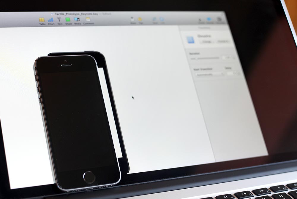
It is essential to prototype at scale 1:1 - Under this frame, place a rectangle shape equivalent to the screen size of the device. Put aside its characteristics (width, height, x and y positions) as they will be handy down the road.
- Duplicate this slide so you have a blank slate to start with.
- Add the elements of your first screen using Keynote shapes and text.
- Duplicate this first state into a new slide and modify them to represent the second state of your interface. If new elements appear from nowhere on this second screen, test the Keynote automatic solution (generally a fade in opacity). If this isn't want you want, copy these new elements and paste them in the first slide. You can then hide them by adjusting their opacity, their position, or both.
- Another solution to make objects appear is to use the build effects within the slide (as opposed to transition between two slides).
- Be wary of the succession order of the objects in the Z dimension (which one is on top of the other) and of objects groups, they can influence how a magic move transition play out.
- Once the screens and transitions are finished, put a white mask on top of everything to hide the objects placed outside of the device, then bring the device frame at the very top. Repeat for every slide.
- The prototype is set, and it's time to rehearse so you can demo your idea in the most credible fashion. Touch is of course entirely simulated, but needs to be part of the prototype if you want to get as close as possible to reality.
Pros
- Swiftly testing out layout and/or behaviour of one or multiple screens.
- Easily compare different possible scenarios for a given task completion.
- Communicate an idea to colleagues able to project themselves beyond the lack of graphic or kinematic realism. Gathering feedback at this stage where nothing is settled is a considerable plus for saving development time.
- Manipulating an interface, even by faking it, can point to sizing issues of active zones that seemed perfectly fine on paper.
- Sharing these sketches with people who don't have Keynote through video exports.
- If an idea gets the green light from such a document, development can start in parallel to graphic design work.
- It also works with a video projector. You just need to move your entire body to simulate a scroll gesture.
- It's possible to refine these documents by importing static comps from Sketch or Photoshop.
Cons
- Although these documents help developers getting a good idea of how an interface should behave, they can't use the work you did (on sizes, positions, timings) for production files.
- As such, the document doesn't easily export to a mobile device.
- Finger prints will invade your screen. You'll get used to it.
- The lack of a tool to control the z-index of the objects on the slides make it quite tedious some times.
- When you change the scale of a group that has text in it, the size of the text doesn't scale accordingly, you have to edit it by hand.
- It's not possible to move an image inside its mask during a transition.
- Animations can be tuned up to a certain point. Timings and successions will seem jaggy in some situations, and it demands a bit of imagination to see what it could be. This is an area where Origami is much better.
- Building a portrait to landscape screen rotation can be challenging depending on the screen complexity.
Some advice
- Copy paste an object between two slides will place it at the same coordinates. It can be a real time saver to work with this in mind.
- Apply the magic move on your first slide, before building the screens. This way, when you'll duplicate the slide, you won't have to set it.
- If you're new to Keynote, take the time to familiarise yourself with the difference between build effects and transition effects.
- It's handy to have some sort of lego box slide where you put all the interface elements you would often use.
- Move the elements with arrow keys (+ shift if need be) and keep count so you don't have to open the format/arrange pane to control their position.
- If you need to modify the next screen more than Magic Move can handle well, you can use a buffer slide with automatic transitions so it's invisible when you play the slideshow. Useful when you need to modify objects within a group. In the example file, this is what I did between slides 7 and 8, or 10 and 11.
- Make sure all the elements are present in the start and end slides if you want to keep control on what happens during the transition.
- Keep in mind the z position of your objects.
Conclusion
With a few hundred slides done since last february, colleagues (designers, developers or project managers) having validated this technique value, I thought it was ready to be exposed and shared here. I would be interested in having your feedback, and see if this idea could be pushed a little further so we can all get better at quickly explore interface ideas.
Download the file, tell me what you think. If this has teached me something, it's the importance of bringing an idea to reality as far as possible before asking a developer his time and talents. It might be easier for us designers to visualise mentally, but this ability goes only to a certain point, and a number of small important details can slip through our ideas. It's important to get them out of the way, and this tool helped me a lot in this regard.
The iPhone frame used in the example file is from Pixeden.
If you download the Keynote file, you'll need the Blokk font to read it correctly. It's a great font for placing neutral text in zoning with no effort.
2014.09.03: as @louije reminded me on twitter, Apple had a session about app prototyping during the last WWDC. I saw a mention of this session on twitter the week before, and was quite disappointed I couldn't be there to know if Keynote was part of the recipe. I had forgotten about it until yesterday, and I have looked at the session. It turns out they use Keynote as well, only with much more talent. Take the time to watch it, it's far more didactic and enjoyable than what I've written here. They choose to use Keynote for iOS in their process which I decided to avoid, but the guiding principle is the same: how to decide as fast as possible if an idea is worth exploring further or not.